Book Review – Pattern + Palette & Logo Lounge 4

- Adobe
- adobe swatches
- Bill Gardner
- Book
- Catharine Fishel
- Embody 3D
- energy
- equivalent software
- food
- format
- glossy black and white products
- Harvey Rayner
- Illustrator
- industrial design
- Katherine Alexander
- Kathie Alexander
- Logo
- Logo Lounge
- Martin Gibson
- Palette
- Pattern Book
- pattern palette
- Rockport Publishing
- shape
- South African Graphic Design Council
- tertiary colours
- typography design
- working designer
Article by Martin Gibson – @embody3d @martingibson – 26.011.2010
I was fortunate enough to get my hands on two books from Rockport Publishing and I couldn’t help but notice that they make the perfect couple! So I thought why not do a double-review for this lovely young pair. One part of the relationship is Pattern + Palette Sourcebook 4 and the other is Logo Lounge 4, both brand new books from Rockport! Designing a logo is such a difficult and though-provoking process as one has to think about colour and content, and of course under content there are considerations like typography, shape, style etc. Not to mention how to be original, yet simple, yet have a sense of timelessness that it wont go out of fashion in a few years time.
This made me consider all the logos I have designed in the past and all the times I have neglected having a justified colour palette for a logo or branding pack. I, like many designers are often guilty of just using some of the default Adobe Swatches. Some of these swatches which are great, but in the world of infinite colour choices and an ever-transforming colour landscape some real thought needs to be put into colour. For example what is the logo going to look like inverted, or on a website, what are the secondary and tertiary colours that can be used to complement your mono or dual tone logo? I firmly believe these 2 books should be purchased in parallel; use Pattern + Palette Soucebook 4 for selecting the colours of your logo or graphic design, and use the Logo Lounge 4 as the graphic inspiration or starting point of your shape and typography design. It is often difficult to get started designing a logo so it is often best to take baby steps, and deciding colour can be a quick way to control and constrain your design to something more manageable. I think it’s important to decide colours immediately as if you design the shapes and typography first, you will then be thinking what colour looks best for the particular shape rather than what colour is most applicable for the client company.
Pattern + Palette Sourcebook 4
Rating:
[rating:3.5]
Pattern Book – Pattern + Palette Sourcebook 4 – A Comprehensive Guide to Choosing the Perfect Color and Pattern in Design by Katherine Alexander and Harvey Rayner, published by Rockport
Pattern + Palette Sourcebook 4 is a book filled with swatches and wallpaper-like patterns from start to finish. At first thought this book may appear to be of niche-use to the working designer. However when approached with an open mind fantastic things can happen between the reader and the material.
In the introduction the authors Kathie Alexander and Harvey Rayner make no illusions to this by providing an insightful disclaimer:
Colour preferences are of personal choice and very subjective, enjoy exploring the Technicolor pages of this guide with curiosity and an open mind.
These patterns can be used for website backgrounds, interior wallpapers, carpets, ornaments and other interior finishes. The swatches can be used for logos, banners and any other artwork imaginable and let’s not forget, especially for all you Embody 3D readers out there…why not use these swatches in product design as well? Aren’t you tired of seeing all these glossy black and white products all the time?
Pattern + Palette Sourcebook 4 is split up into fun categories like: life luxuries, galaxy, globe trotter and dark glamour. At the start of these chapters is a real emotive plea by the authors explaining the desires and wonders the patterns provoke. These descriptions are not only fun but play into a lot of new-found research into colour psychology.
By combining blacks and browns the following colours evoke passion, power, reliability, and stability.
In the corner of each page there are CMYK values of the colours utilised in the patterns as a quick reference. The reproduction of colour on the pages closely match the on-screen representation of the colours which gives you an accurate depiction of the material.
Pattern + Palette Sourcebook 4 is like a painting, you get out of it what you put into it. If one invests a lot of energy and experimentation to these swatches and patterns one will gain many design victories. Unlike many other reference material for designers, Pattern + Palette Sourcebook 4 actually gives you these tools for the taking with a CD-ROM containing all the designs and swatches in vector format copyright free! These files are in EPS format which means they can be easily opened in Adobe Illustrator or Corel Draw or any other equivalent software which recognises the open EPS format. These vectors make it ridiculously easy to not only replicate these styles but allows you to lets say grab one pattern and try it out with a different swatch featured in the book with relative ease.
Logo Lounge 4
Rating:
[rating:3]
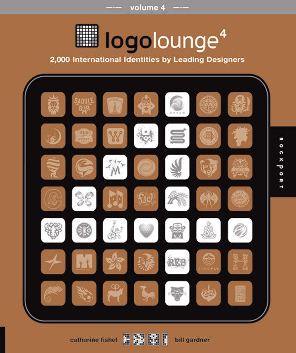
Logo Book – Logo Lounge 4 – 2000 International Identities by Leading Designers by Catharine Fishel and Bill Gardner, published by Rockport
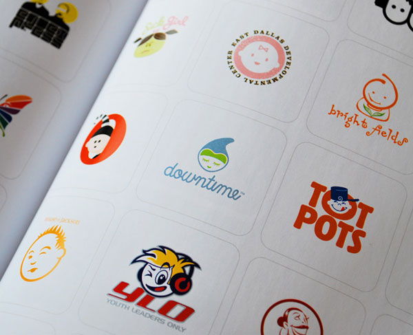
The latest version of Logo Lounge, Logo Lounge 4, offers a tyrannosaurus rex logo offering in a tidily 145mm x 160mm frame. Following from its predecessors the Logo Lounge series showcases some of the best logo designs from the leading graphic design houses on the planet. The book contains a whopping 2000 logos that have been culled down from an initial list of 28 000 logos that have been tirelessly assessed. This makes the standard of all the logos featured in Logo Lounge 4 just of the up-most professional quality.
The selection of logos by the 8 judges have been wise; there are no logos filled with hectic gradients, no logos with a million colours, or logos that have conflicting forms…these logos are intelligent and modern and certainly have a sense of timelessness. As with anything graphic design your opinion may be subjective, but by the last logo you are bound to appreciate 80%+ of the logos throughout. Although these logos are modern, Logo Lounge 4 doesn’t make the mistake of having 2000 logos that all look frustratingly the same. The logos are filled with diversity! Some are complex, some are simple, some are colourful, others very mono, some are fun, some are serious…I could go on and on.
The book starts with 8 brief backgrounds of some of the designers who have work featured in the book. In these pages the designers outline their logo design process and give some justification to their featured logo. This section could certainly be longer, and with all due respect these pages have more a purpose of being self-promotional rather than offering any real insight or value to the reader. For example:
De Abreu has won numerous national and international awards for his work. He often speaks at design conferences and seminars and is on the executive committee of the South African Graphic Design Council…
These 8 self promotional rambles although give some authenticity to the quality of the designs, the self-praise goes too long, and there needs to be more information about design and justification.
Another criticism about Logo Lounge 4 is that some of the logo categories (chapters) are too specific and by doing so they make the whole categorisation completely illogical. For example there are some great chapters like: initials, typography, enclosures, calligraphy, crests, shapes and symbols. Then messed around with all this are these way too specific chapters like “fish, bugs, reptiles and food”, the book makes the painful mistake of getting confused between the subject matter of logos and the type of logo style itself. I can’t understand why you would feature logos as specific as fish, bugs, birds and reptiles and not have a category dedicated to vacuum cleaners or elephants as well? This needs more consideration for the next release.
However don’t let my minutiae and all to typical criticisms get in the way of the most important aspect of this book which is great logo designs. In this area the book truly excels. It’s just a shame that the Logo Lounge 4 unlike Pattern + Palette Sourcebook 4 book doesn’t provide the 2000 logos in a CD-ROM as well. Well I guess this is for the best otherwise there would be millions of logos that look eerily similar hehe.


2 Comments
[…] Book review of design resource book Pattern + Palette & Logo Lounge 4 at Embody 3D […]
[…] around the world. One of the great benefits of Logo Lounge 6 is the larger page size compared to Logo lounge 4 which we have reviewed previously. This larger page size makes each logo far more comprehensible […]