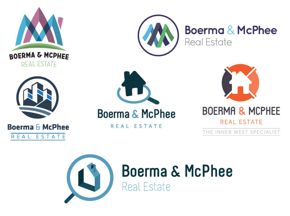
In this logo design for Boerma & McPhee, a real estate company, we were provided with an original logo which had 3 M’s which overlapped each other. So in some of the designs we continued this motif but we also came up with some modern alternatives including the house inside the magnifying glass which symbolises searching for different real estate. Or in one of the examples it can also symbolise capturing a home as if you could so using a net.


