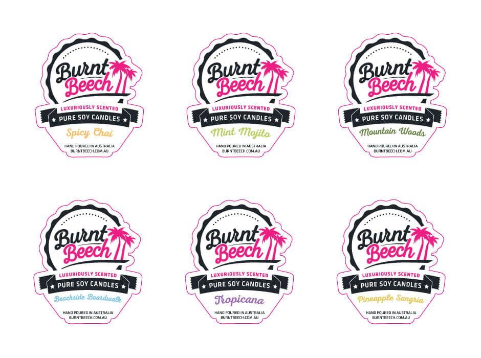
This label design was the main label which would go on all candle jars for Burnt Beech. It once again has a permutation for each flavour and a standard design which is used throughout Burnt Beech’s branding. I had to try and fit all the necessary information on a small label whilst still making the text readable. I used different text hierarchies to draw attention to different text elements and minimise the importance of other information.