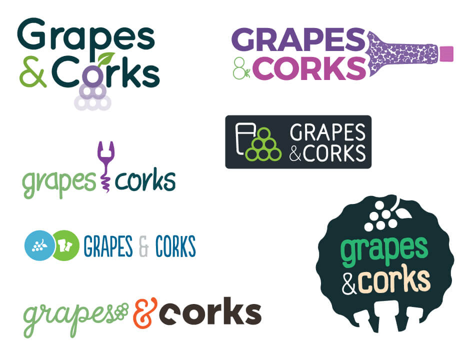
In this fun design for a winery in Europe we tried to play with a literal interpretation of their business name by featuring grapes and corks cleverly in the design. We presented a wide array of designs so something was bound to catch the customers eye. The customer also wanted a grape like colour scheme so we used a lot of green and purple in the design.


