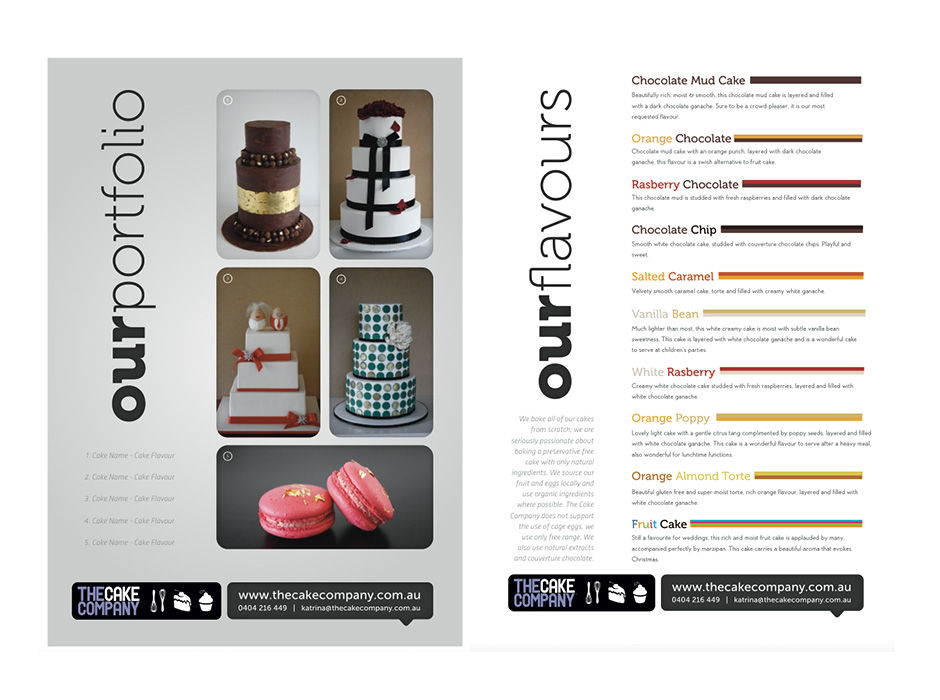
The Cake Company attends many Cake Expos and they needed a flyer to hand to customers. This design shows just 2 pages of the 4 page brochure. We used rounded corners on the images to soften up the images and to make the graphic on the whole appear more friendly. Of course you can’t taste flavours from a piece of paper but we visually represented the cake flavours on offer by using colour blocks which create a simple info-graphic layout.


