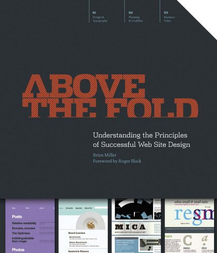
Above the Fold – Understanding the Principles of Successful Web Site Design
Article by Martin Gibson – Twitter: @martingibson @embody3d – 30.08.2011
Above the Fold – Understanding the Principles of Successful Website Design by Brian Miller and published by How Books is an insightful primer on understanding the anatomy of websites. Above the Fold covers all areas of websites from design to business implementation making it almost essential reading for students, the elderly trying to understand the internet and websites and of course business owners and prospective website designers. The aim of the book is to demystify the web in all its clutter and complexity and start at the very beginning aspects of websites up to more intermediate issues. Above the Fold is split up into 3 sections: Web Design & Typography, Planning & Usability and Business Value. Please read on to find out a little bit more about these sections!
Web Design & Typography
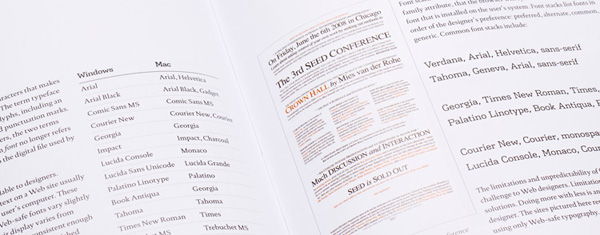
This section of the book starts off with the basics, explaining what on earth the internet is and provides statistics about colour depth, resolution, operating systems and browser types which helps frame the remainder of the section. It talks about those often highly criticised plugins that you either love or hate like Silverlight and Flash and whether designers should invest in these dynamic tools.
One of the real highlights of this chapter is a four page timeline detailing when revolutionary concepts hit the web like the search engine, the encyclopaedia, the social network and video streaming. It’s sometimes difficult for a tech-head like me to fathom a world without these essential service technologies. One thing that is ignored in this chapter is the technological developments of internet service providers allowing more bandwidth so we an discover and interface with new types of rich media content.
Another aspect I really enjoyed about this chapter is how different companies have adopted their traditional media to the web in different ways. Take for instance the New York TImes which has strived to display the news like a traditional newspaper whereas other companies have utilised the dynamic nature of the web in different ways with varying successes and failures. This section really challenged me to question the existing conventions of websites like why do we have headers, footers, sidebars and main content areas; are there better ways to layout web content?
Planning & Usability
In concept I think there definitely think designers should invest more time and resources into planning and usability of websites. It is shocking to see even high-caliber designers create some of the most horrid interfaces and fail basic usability issues (don’t get me started with the navigation on some flash websites I have come across). However Above the Fold potentially gets into a little too much depth here by recommending a SWOT analysis (strengths, weaknesses, opportunities, threats) be performed. In reality however any website contractor or business would never have the time to undergo such an analysis. However if you are developing your own website it is a wise idea to identify your market purpose and key differentiators. It also discusses project timelines and brief writing in a simplistic way, but perhaps doesn’t facilitate every type of website. There’s an excellent section here on file naming and folder organisation which is so invaluable and something I regret not doing earlier in my design career.
Business Value
Business Value talks about the business elements of website design like return on investment by statistics tracking and tips and tricks for getting discovered on search engines. As I always say there’s no point designing a hot website unless there’s no one to see it. It also talks about hosting advertising on your website or undertaking a search marketing campaign.
In Conclusion
Throughout the book in general there are some great diagrams, example websites and illustrations which really bring home the main points of Brian Miller. Brian himself is an award-winning designer and lecturer who specialises in branding for the web and print. Brian also manages the Brian Miller Design Group and he teaches at Shintaro Akatsu School of Design.
I certainly wish I had a guide-book like this when I first started designing websites as I heard a lot of things about CSS and PHP but I never understood the most important question…why? Why do we have so many coding platforms, why can’t there be just one? And I guess the answer to this has to do with the multifaceted evolution of websites which has been pushed and pulled by different organisations, businesses, societies, individuals, browser technologies and standards. These are the kind of interesting questions that are clearly explained throughout the book.
However before you purchase Above the Fold you need to understand its scope and context. This isn’t a book about how to design great websites. It really is a documentary/textbook illustrating the conventions, opportunities and constraints of web design at this present time. While it does provide some direction about what a successful website design might be, it never deliberates in these transgressions nor does it ever provide tutorials on how to physically achieve these aims. This is the scope of Above the Fold; it is not suited to a semi-professional or above. However, this makes the book perfect for a beginner who is perhaps considering getting into website design for the first time and wants to understand what they are about to get them selves into.
[rating:4]


