Color Inspirations

- Article
- Auto
- Color
- Color Inspirations
- colour swatches
- darius
- designer
- development
- Draft
- Embody 3D
- essential reference guide
- fun
- graphic design programs
- industrial chemist
- industrial design
- inspirations
- johann wolfgang von goethe
- Martin Gibson
- martingibson
- michel eugene chevreul
- primary and secondary colours
- Product
- product designers
- rating
- RGB
- section
- theory
- use
- wolfgang von goethe
- Yellow
Article by Martin Gibson – Twitter: @martingibson @embody3d – 30.09.2011
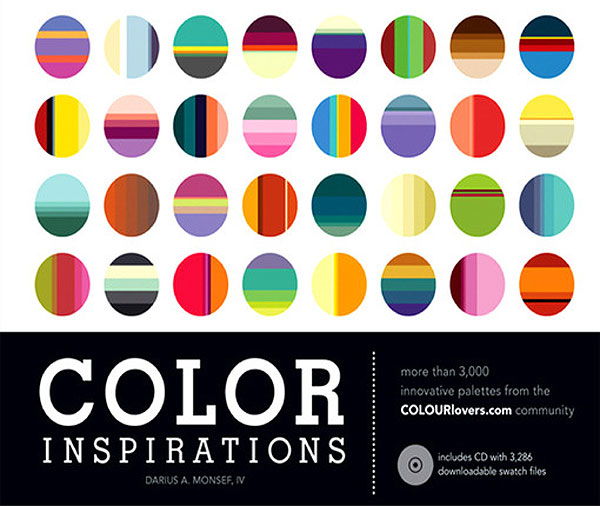
Colour is such a critical factor in design, just as ergonomics, rituals of use, functionality, shape and style and so on. But unlike these factors when do we ever study colour at university or college? Well recognised universities graphic design programs often have classes on colour and typography but it never seems to be promoted into the industrial design curriculum as commonly it is the last thought in the industrial design process after or depending upon material selection. That or colour in some contexts is removed from the designer completely and delegated to the marketeer. With this in mind it was a great blessing to receive Color Inspirations by Darius Monsef and published by How Books which is a comprehensible educational title on colour.
Color Inspirations is split into two main sections, firstly some theory/history on human understanding of colour and then later a huge assortment of colour swatches categorised by primary and secondary colours and then a special section on colour from nature which is most fascinating.
The Theory
For so many years I have used RGB and CMYK and HSB somewhat and I understand what they abbreviate but little did I know about their historic development and relation to the human eye and the physical world. Little did I know that the first modern colour theory was development by German poet and government minister Johann Wolfgang von Goethe and a French industrial chemist Michel Eugene Chevreul who developed the Red, Yellow and Blue subtractive theory. This then evolved into RGB and then RGB would evolve into CMYK with the development of printer technology. The funny thing about colour theory is that it’s so simple to understand, it is borderline primitive and makes one question that anyone could have figured it all out. However the mechanisms that underly these principles are actually quite complex which makes our Adobe Illustrator colour wheels, eye dropper tools, and colour toggle sliders seem to be a gift from the heavens. The theory is fun and thought provoking and doesn’t bog you down in miscellaneous facts.
Color Inspirations goes beyond the theory and onto colour in society and culture. How we have used colour in flags, in movements and how we have interpreted colour to mean different feelings and emotions. Like many books I have read Colour Inspirations goes along with the notion that colour does behold persuasive powers over us, but never really challenges this from a raw scientific perspective. While this section does have sporadic references it only lacks in its ability to compare and contrast differing theories on colour and explore unorthodox or even non-western ideas. For an introduction to the main course, the swatches, the theory plays a welcome pretext especially for students.
The Swatches
The swatches are broken into 15 colour categories which include:
- Red
- Red-Orange
- Orange
- Orange-Yellow
- Yellow
- Yellow-Greent
- Green
- Green-Blue
- Blue
- Blue-Violet
- Violet
- Violet-Red
- Pink
- Brown
- Grey
In each one of these chapters the swatches are broken into the following sub-categories: – Monochromatic – Analogous – Triadic – Split Complementary – Complementary – Other
Of course it is difficult to visualise the sheer quality and volume of the swatches featured in Color Inspirations, but it is truly outstanding. Furthermore each swatch group it lists CMYK, RGB and web colour codes so you can easily convert the swatches into Illustrator, Photoshop or a website. But why bother doing this manual labour when at the very end of the book Color Inspirations gives you a CD with all the swatches nicely planned out!
My favourite and what I believe is the most imaginary aspect of the book is a section called ‘Color in Nature’. Color in Nature dissects photographs from animals like birds and fish to landscapes and aerial photography to draw inspiration for swatches. The section is a real eye opener and illustrates with great clarity the diversity of nature. This was biologies and evolutions account on colour development uncompromised by computers and human imagination.
In Conclusion
Color Inspirations is an essential reference guide to any designer of any field as colour is integral whether you’re a product designer, graphic designer, architect, animator, you name it. The book is a great starter piece on colour theory and utilisation although it doesn’t cite product designs in any form. It is probably not targeted to the seasoned ‘colouteer’. I think especially for industrial designers and let me dare say fashion designers I feel like there is a dier need for some of us to step out of this white and black box we have entrapped ourselves into these last 2 decades. Product designers have been playing it safe picking greyscale colours as a primary background with flares of colour highlights and trims to stylise products; what happened to the 70’s and 80’s and experimentalism? People still love colour, so lets use it! Check out Color Inspirations and be amazed!
[rating:4.5]


0 Comments
Nice find! This sounds like an interesting read. Thanks for sharing!