Exhibition Design by Philip Hughes
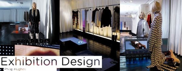
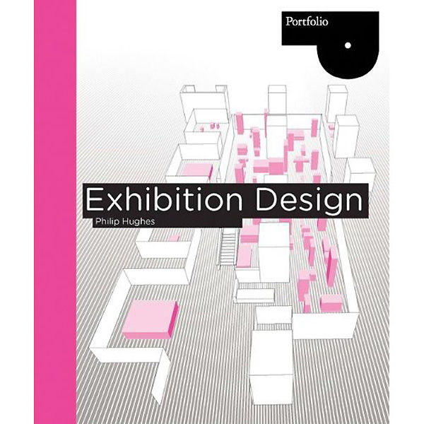
Every so often on Embody 3D we come across a book that just dominates what it set out to achieve and Exhibition Design by Philip Hughes, published by Laurence King, does just this. It isn’t a glossy magazine, it isn’t a reference item, Exhibition Design is a bible. A 224 page thriller of the intricacies, thoughts, processes, strategies that go into exhibition design in all its glory. I am a designer who has never personally had the pleasure of being able to design a temporary masterpiece but I found it fascinating, aesthetically inspirational and totally relevant to any design discipline. Please read on!
Article by Martin Gibson – Twitter: @martingibson @embody3d – 10.06.2010
Exhibition Design is a very detailed book giving you every step of the exhibition design process from the brief, the visitor, the site, design skills required, interaction, new technologies, materials, drawings as well as construction and delivery. The book is most applicable to exhibition designers, interaction designers, new media designers, project managers, event managers and coordinators, or any other designer who want to put their client’s audience first. There are many books on the market that tend to over generalise topics of interest, and after the book has been read you really take nothing away from it of interest. On the contrary, Philip Hughes has nailed down the inconspicuous an nitty gritty of the field. For example, the book tackles not only the physical design of exhibition stands but also details like, how to engage a visitor as he/she approaches your stand? How people learn and interact with material they have never seen before. How to make exhibition displays engaging to children, the elderly and the list goes on. It really does force you to take a step away from the sketchbook or CAD program and have a considerable thought about what we really are designing.
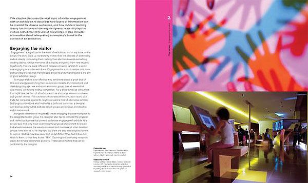
The aspect I like most about this book is that it isn’t just pretty pictures (well it has that) but it talks very educationally about what is a good exhibition design. Most importantly the author doesn’t make the error of talking about aesthetic this aesthetic that. Exhibition design isn’t a branding exercise and developing a display stand to just look like what the company represents, it is about an interaction. A journey of what your clients customer experiences when he or she is first confronted by your exhibition display. What do they feel? Who do they talk to? What do they do? What path do they walk? Exhibition Design very clearly explains all these processes in a real detailed and holistic way, making it a perfect reference for any exhibition designer, interaction designer, but also any designer who wants more founding knowledge on designing for the end user.
Also the scope of this book isn’t what I first anticipated. Often when I hear people speak of exhibition design, I immediately think of convention centres and those typically boring white boxes and info panels. However exhibition design can feature in so many design contexts including museum design, event and entertainment design, festivals, visitor centres, movie or television set design, amusement parks and information panels. The main controversy I have with this book is I really feel it should be called ‘Interaction Design’ the scope of this book I think would be so beneficial to not only exhibition designers but all designers regardless of industry or field.
Some design skills covered include:
- 2D Design
- 3D Design
- Brief Writing
- Design principles – graphics, circulation, lighting, accessibility, industrial
- Presenting ideas to clients
- The viability of production
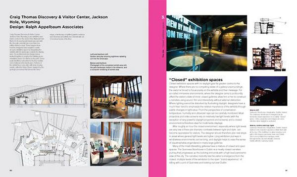
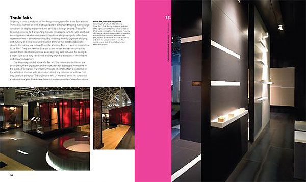
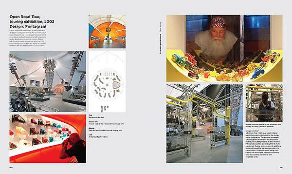
Some of the visual material throughout the book include completed exhibitions from industry professionals, concept drawings, CAD renderings, charts and tables. Oh yeah and the text is big and easy to read 🙂 always a bonus! Students who are passionate about exhibition design this will give you everything you need to know and you surely will be inspired to use the educational principles and the graphics used throughout in your mental scrapbook. Professionals will utilise this book as a reference and to clarify briefs they might be working on currently. I can also see professionals using the book to show clients aspects of exhibition design that are important, or to perhaps persuade a client to go one way avenue rather than another.


2 Comments
To often the nitty gritty of who we design an exhibition space for is lost in mediocrity. Thank you for reiterating that a holistic approach does not equate to blandness.
This is a great book review. I like the part where Philip mentioned it is not all about aesthetics but the interaction of the people when they come to your exhibition stand. To me, that is much more important. A stand can look nice but if it doesn’t interact well with your prospects, it is not going to work that well.