Flourish.Banner.Frame
Article by Martin Gibson – Twitter: @martingibson @embody3d – 30.09.2011
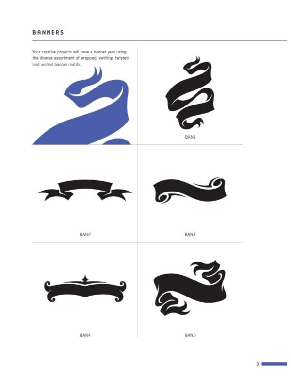
Flourish.Banner.Frame by Von Glitschka and published by How Books provides a delightful assortment of 555 ornaments including banners, frames, flourishes, corners, rings and placards. In the brief introduction Von Glitschka makes a subtle but important statement about graphic design, that it’s little features like ornaments that make design profound and significant. As they say the devil is in the details. Von Glitschka makes the point that ornaments illustrate the inner feelings of a work and its spatial rhythm, which I somewhat agree with. There isn’t much justification or introduction in Flourish.Banner.Frame but it does make some brief points about the strength of repetition and it’s influence in not just graphic design but also in literature and music.
“My motivation behind this volume of original ornamentation, flourishes, borders, frames etc. is to provide a digital resource of well crafted,elegant and creative motifs a graphic designer or illustrator could use to beautify his or her own design work. It’s my hope you find this book useful, inspiring and informative.”
I have very mixed feelings about Flourish.Banner.Frame. Parts of me think that with an open mind and a great sense of creativity there is tremendous potential to exploit these flourishes. However another part of me says some of these designs are a bit cliche, even cliparty. Some are overly resolved, dated or lack context to modern design. However some could see this as its attributable trait.
All the ornaments are black and white giving a highy contrasting page which best reveals the shape of the ornament without bias of colour and texture. But in this blandness and sharpness it fails to inspire with only a handful of incontext images of the ornaments in use. However a positive is that the ornaments are all contained on a CD-ROM in vector format well labelled and categorised.
In supposition Flourish.Banner.Frame in the right hands great things can happen. But with less creative hands really cliche designs could come of age. The biggest loss of this book is not revealing what good ornaments look like but rather how to create your own or how to modify the showcased ornaments in creative ways. Despite the book appearing quite heavy by its large page format and its minescule introduction one would assume there are tonnes of ornaments, but for some reason the book feels a lot more bare than one would think. This could be because of its thick gsm pages and the fact it only showcases 6 designs per a page. However what I really think is the issue is the repetitiveness of the designs where at times little diversity between concept pages is achieved. There is a real sense of classical design in Flourish.Banner.Frame but it lacks the fun and bubbley nature of web 2.0.
[rating:3]


