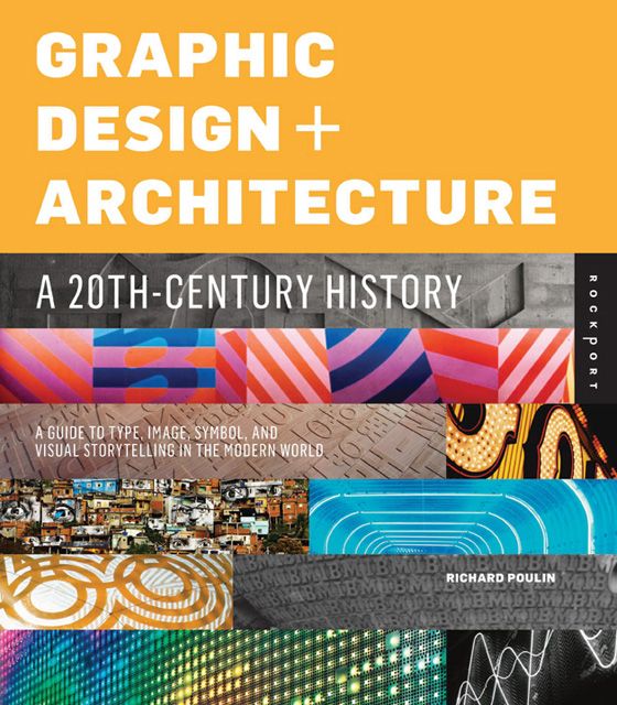
Graphic Design and Architecture – A 20th Century History
ISBN: 9781592537792
Graphic Design and Architecture – A 20th Century History – A Guide to Type, Image, Symbol and Visual Storytelling in the Modern World by Richard Poulin and published by Rockport is a rich highly graphic history of style and design in the last century. Many will ask why should I bother investing my time in the 20th century when design is about the here and now; and this is a valid question. My answer to that always is, one must know where one has come from before they know where the world is heading. It’s important to know how culture, society, geography and politics has shaped the design landscape. It’s important to know what’s been done before and more importantly why it was done that way.
The title commences with some 19th century influences that helped the shape the early 20th century and then it gets straight into it chapter by chapter tackling a couple of decades each chapter. The book touches on individuals like Dessau Bauhaus and Herbert Bayer to actual physical designs like The New York Times Building and the Melbourne Exhibition centre. The book has adequate depth tackling pretty specific personalities and designs whilst still covering an international spectrum of designers and objects. However it must be said this is very much a western history of design. The title is able to pick up macro trends easily like how the war affected design, and how the philosophy of theologians changed values which therefore changed design. All sorts of projects are taken on throughout including typography, images, symbolism and architecture.
It’s a fascinating read or browse as one slowly unravels design by design into the modern era. After reading over the book I was really struck at the shear randomness of this evolution. Like why did design go through this art deco period, and then this streamlined industrial design of objects to minimalism. It all happened so organically yet so randomly as if one were to chop and change the order of these macro trends I am sure they could have easily made just as much sense.
Graphic Design and Architecture also helped me frame what design is now. It’s a question designers really ask, “what does 21st century design(s) look like?” What properties of a design today make it fit into current design. What will distinguish the designs today from the ones in 20 years time, how will they categorise us?
The title is well weighted, with not too much text, and not too many images, however the images it does utilise are beautiful illustrations that exemplify the text. My only problem with Graphic Design and Architecture – A 20th Century History is that if one reads the title one could be under the impression it is a critical history of design and architecture. However it is rather a history told through people and projects. It doesn’t analyse or tell a story, it simply notes key projects and people that shaped a particular era. So one has to kind of make up their own history on what links some of these projects and people together. It is this kind of analysis that would have added more value to the title; more emphasis on storytelling supplemented by these projects would have been a welcome balance.
Graphic Design and Architecture – A 20th Century History is a great graphic history and I am sure would be a welcome addition to any designers bookshelf. Don’t expect a detailed analytical history rather beautifully illustrated and documented projects and people that helped shape the last 100 years. It is both a good reference title for students and a good bedside read that isn’t too draining!
[rating:3.5]


