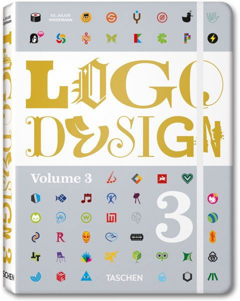
Logo Design 3 by Julius Wiedemann
Article by Martin Gibson – @embody3d @martingibson – 28.03.2011
Fortunately Logo Design 3 by Julius Wiedemann and published by Taschen is unlike most logo design books that come our way and offers tremendous value for money. Before I get into the specifics of Logo Design 3, I must give a shout-out to Taschen for once again pursuing this beautiful book design which is identical in style to a similar Taschen book we have reviewed ‘Stationary Design Now’. To some a books physical appearance may not be such a big deal, as they say “content is king”, but one can’t ignore the beautiful hardcovers Taschen makes with their rounded cornered pages (no paper-cutting here!), elastic bookmark, superb printing on nice 120GSM pages and in general beautiful layouts and designs.
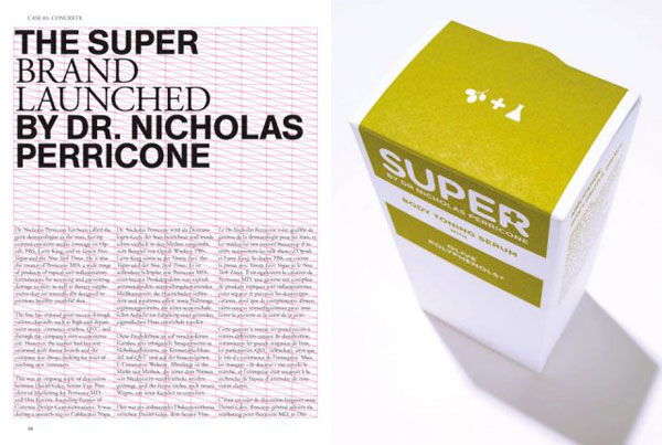
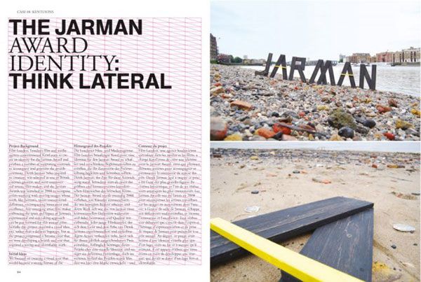
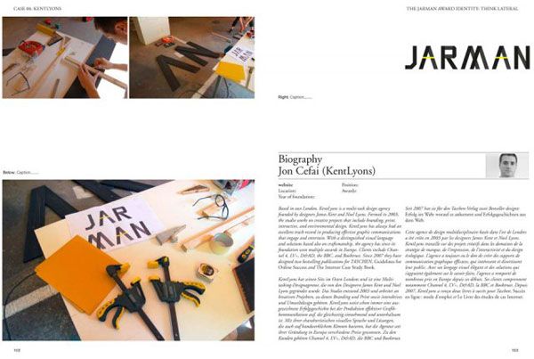
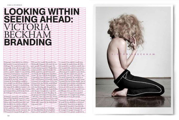
Anyways on with the review! Logo Design 3 not only exhibits a whole range of logo designs but also has a sizeable section dedicated to case studies, 11 in all. The remainder of the book is filled with logos from graphic design artists from the world over.
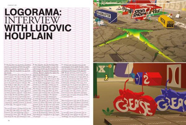
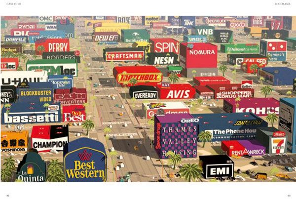
All the case studies are translated into English, German and French which is great for our international readers, but for us English folks the text will seem deceiving shorter than what it appears. The case studies on the most part are entertaining and informative, varied in nature, but probably 8-9 studies would have been sufficient. 127 pages of case studies can be a little overbearing and self-indulging, but in saying that you can never ever complain about getting too much of something…no-ones forcing you to read it. The case studies are mixed up between designer interviews, biographies and documentaries. Some studies include the development of the Bicentenary of Argentina’s Revolution logo, an interview with Oscar-winning Director Ludovic Houplain for his short film Logorama and a biography of Helmut Langer, President of the International Council of Graphic Design Associations and a Professor at Nagoya University of Arts japan and with over 30 years industry experience. I guess you can gather from this brief spiel that this is no paid advertising section rather a high-caliber study of leading industry professionals.
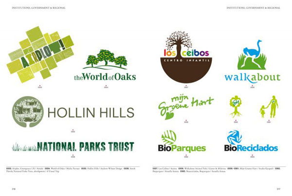
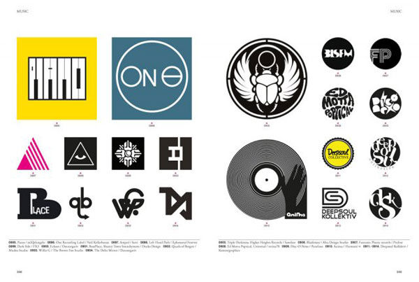
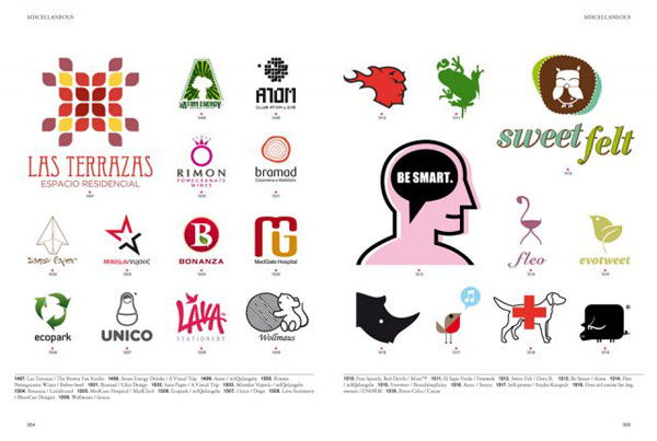
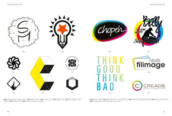
As mentioned previously the book then divulges into what seems to be an insurmountable assortment of logos. But I mean this in the most positive of lights as this logo documentation is done right! Quantity yes, but quality is never compromised. Although it seems like every logo known to man fills the remainder of the book it does seem to be well curated. Logos are grouped logically by theme and tone on a page by page basis. The logos positioning and size is purposeful and well thought out. The logos are just about a perfect size being around 1.5 – 2x the size of a standard letterhead, that way you can appreciate what they look like in context, yet still get an amplified view of their critical styling.
There is a lot of theme and variation going on with some logos, that is, there are logos which are part of a series making the sheer bulk of logos more manageable.
The greatest strength of this logo section is that structurally it is well categorised. Many of you are aware of my constant complaints about the categorisation of the Logo Lounge Series. The editors/curators/adjudicators of Logo Lounge could certainly learn a thing or two from Logo Design 3. Categories are divided into industry sectors making it easier for graphic designers to find relevant competitors or inspiration for a client they are working on. These logo sections include:
- Creative Industry
- Events and Entertainment
- Fashion and Apparel
- Institutions, Government and Regional
- Media
- Music
- Retailers and Food Outlets
- Service and Business
- Miscellaneous
At the end of the book it credits each logo with its design company, designer and designer website.
I really think Logo Design 3 has gone above and beyond the expectations one would have of a logo book. It offers quantity in case studies and in logos, it offers quality in reaching highly ranked designers and professionals from around the world and the logo portfolio is finely curated with the utmost care. Best of all it offers all this action at a really affordable price.
[rating:5]


