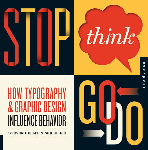
Stop Think Go Do by Steven Heller & Mirko Ilic
Article by Martin Gibson – Twitter: @martingibson @embody3d – 20.03.2012
ISBN – 9781592537662
In essence Stop Think Go Do – How Typography & Graphic Design Influence Behaviour by Steven Heller & Mirko Ilic, published by Rockport is portfolio book covered by a mirage or thought provoking title. The title Stop Think Go Do is picking up on the street sign mentality of advertising and messages being about conveying messages to a given audience.
The book is structured in this spirit with 8 snappy chapters including: inform, advocate, play, caution, entertain, express, educate and transform.
In more detail:
Inform – parallel to educate but not exactly the same. It involves tweaking the audience by bringing to light an issue, essence, or concern that requires contemplation.
Advocate – the most common of all because designers are often called upon to create a messages that rouse an audience to support and therefore engage in an issue or event.
Play – what every design does, whether knowingly or not. What is moving around a word and image but a puzzle or game? This is the essence of the following sections; through play we learn entertain, express, inform and transform.
Caution – the most classic graphic design behavioural message genre. Keep out, no trespassing, wrong way, beware of dog, and other cautionary missives are designed to ensure health and well-being of one and all.
Entertain – the genre of behavioural design that everyone enjoys the most. No one is threatened by entertainment, which has various outcomes but one fundamental goal – to bring enjoyment.
Express – the largest growth area, for more designers are using graphically designed words and slogans as a means of expressing personal beliefs, philosophies, and manifestoes with the goal of influencing others.
Educate – a combination of all the categories here, except specifically it is the rubric under which more detailed knowledge messages are shared.
Transform – is an overlapping category whereby projects borne of play are transformations of what they originally appear to be. There pieces are sly and wicked, using visual puns and graphic manipulation to come in under the perception radar.
As you can tell by these sections that the categorisation of portfolio items is all over the place in Stop Think Go Do as of course a portfolio item can be both cautionary and entertaining so where do you place this item? This categorisation becomes so useless that as a reference guide it is unusable as a designer doesn’t looking for examples of works that are playful or expressive. More so these topic areas are inherent in the style chosen by the designer as one could have a playfully told safety message for the construction message or a cautionary detail at the opera.
Parts of me commend this book for going back to the core of graphic design, which is about communicating a message, it’s not just about being aesthetically pleasing on the eye. Other parts of me snuff at this book about it is just stating the obvious, like of course graphic design is all about communication and the chapter titles have some universality. Don’t think that Stop Think Go Do is a deep book about philosophy or education, this book is really a portfolio showcase with a wistful introduction, nothing more, nothing less.
Criticism aside, this book is pretty good. Let’s face it, this is a book about showing off sexy graphic designers from some of the top graphic design firms from all over the world. Stop Think Go Do really excels in this most important area, the designs are fantastic. As stated in the title the book is equally about the study of typography as well as the broader graphic design and you will find a lot of typographical experimentation. I was certainly taken back with this in a positive way. Unlike just having a few credit lines under each image I like how they have put a small blurb on the design to give a bit more information; it gives some critical insight to the artist and the purpose and this context is so important. The page size is relatively large and is printed on both back and white backgrounds to make certain design stick out or to present the designs in the best light; the print is great as well.
[rating:3]


