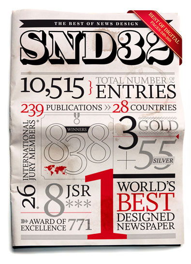
The Best of News Design
Article by Martin Gibson – Twitter: @martingibson @embody3d – 31.10.2011
What an interesting book! The Best of News Design by the Society of News Design, published by Rockport. So often when we flick through a newspaper the concept of design is hard to imagine past all the cliché headlines, cheesy celebrity photos, and just bias and often poorly informed journalism. So often newspapers just seem like the pinnacle of efficiency design. It is like a well-oiled train always on time often compromising on imagination and complex thought. With so many templates, poor budgets and tight deadlines, so often the best designed parts of newspapers seem to be the advertisements and that is no exaggeration.
But every so often you will see a feature or a story that will take your breath away. Something that just stands out or strikes interest, or something you admire about the hard work of the collation or the inventive nature gone behind the piece. The Best of News Design is actually a competition that collates these highlight pieces from newspapers around the world.
For those that are asking, this is a product design blog, why on earth are you bothering with this newspaper design. I can’t stress enough the great relevance this book has to product designers. In fact I would go as far to say this is more relevant than any logo or brochure design book we cover on here. The reason for this is that newspapers have the task of telling a story, portraying information/content in an interesting manner. This is something logos and brochures do in a quasi ultra interpretative way but newspapers have to achieve in a literal mass market way. This is the exact angle product designers must venture to communicate their design. Once you delve into The Best of News Design you begin to appreciate the great lengths the artists have gone to reveal the inner-workings and the true nature of events, subjects and stories.
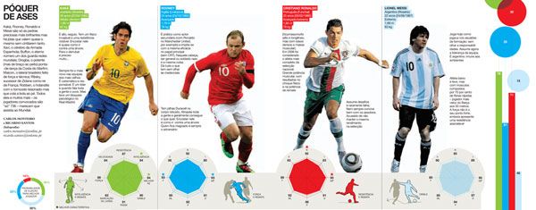
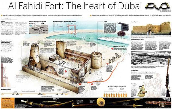
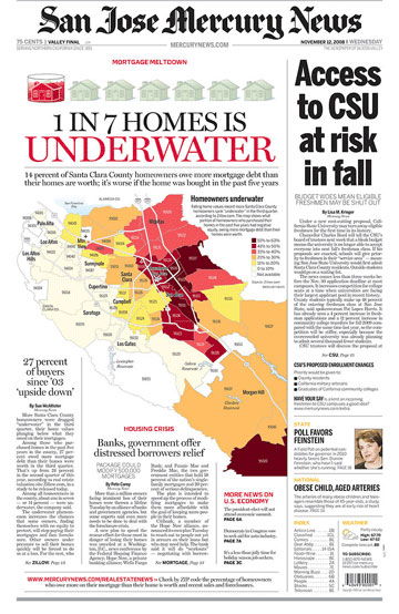
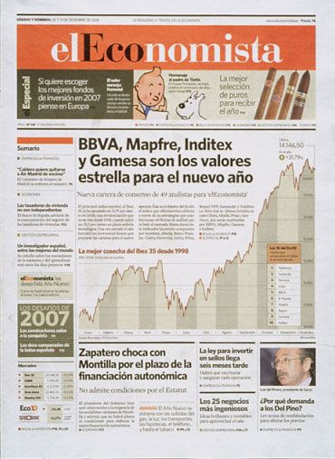
The book has nicely rendered large pages with small captions documenting the newspaper, artist and award category. I don’t want to explore specific examples because I really wouldn’t know where to start as the data visualisations are amazing to say the least. But just to give you an idea of what to expect some illustrations are of wars, sporting events, elections, health, religion, biology, politics, entertainment, crime, natural disasters, history, geology, art and exploration. The authors have picked a real diverse mix of illustrations that cross over languages, cultures, societies, ethnicities and even time which makes the book really interesting. It makes the reader say “where are all these great designs in the real world, they aren’t in my newspaper!”
The illustrations are sorted by award winners and categories like visuals, portfolios etc. While I would prefer it to be sorted into topics like sport, health etc. I can appreciate why The Society for News Design has kept the structure inline with the competition.
Despite The Best of News Design being a competition, one has to appreciate the achievement of bringing these gems into one comprehensive volume, it’s difficult to get these kinds of sources and reproduce them. The book doesn’t have the luxury of nice vector graphics submitted by eager designers, it has to really earn them by discovering them and even at times scanning them in. As a source of inspiration for industrial designers The Best of News Design has loads of potential in the right hands. Even if it isn’t in these crafty palms as a matter of interest and conversation the book is a real entertaining coffee table piece.
[rating:5]


