Type, Form & Function – A Handbook on the fundamentals of Typography by Jason Tselentis
Article by Martin Gibson – @embody3d @martingibson – 17.03.2011
Type, Form & Function by Jason Tselentis and published by Rockport fills a market need I have been crying to be fulfilled. Finally my challenge has been met. I am tired of seeing typography books that are 100 pages on one font, or just show a series of attractive new-age type. These books are of limited value to graphic designers. Graphic designers and typography artists need to know what makes a font a font. What stylistic traits give a particular font its personality and how has typography evolved over the last 1000 years and also its rapid development in the past 200-300 years. Type, Form & Function not only addresses this pivotal need for designers to understand type, but it does so in the most well-balanced and thorough way imaginable; making it what I believe is the best book thus far on Embody 3D!
Let me explore further chapter by chapter why Type, Form & Function is an indispensable educational resource.
History is Explored
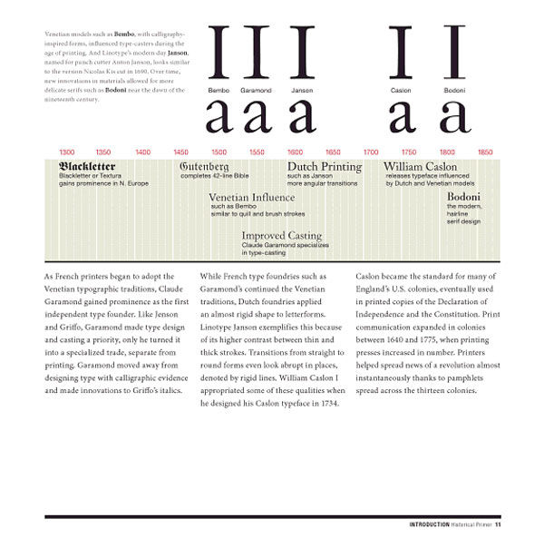
Type, Form & Function begins with a brief but poignant primer on the origins of our 26 letter alphabet which believe it or not has its foundations back to the Phoenicians which had a comparable 22 letter alphabet which dates back as far as the 11th Century BC. This primitive alphabet which to our modern eyes appears to be more like Egyptian hieroglyphics is evolved century by century, region by region giving a clear ancestry of type and the alphabet. The most striking part of this chapter is a beautiful double page timeline documenting illustrated fonts and when they originated. So often when I am in a font menu in Microsoft Word or Adobe Illustrator I sometimes postulate that these fonts just came out of a computer. I forget that real people invented these typefaces in different periods of time. It is an awakening experience to visually see where these fonts lie in relation to one another. Fonts that I presumed were modern like Franklin Gothic are actually nearly a century old!
Type Form is Deconstructed Stylistically
Fonts are then deconstructed to their most essential and core elements and labelled as meticulously as a human brain about to undergo surgery. It is amazing the level of detail that goes into each font; and equipped with this knowledge one can begin to understand the creative potential that can be exploited in font design. It really is the study of what makes an “A” an “A” and what makes a “B” a “B” and it gives you the knowledge to discern one font from another using thorough guidelines. For example there are many similarities between Helvetica and Arial, but what are all the differences and more importantly how would you explain this to a novice?
This chapter also explores how we interpret different stylistic characters within our society with our subjective eyes. For example how our society associates some fonts as being masculine like strong heavy fonts like Rockwell Extra Bold with its chiselled serifs, and curly thin lined delicate fonts like Curlz with femininity. But this is just touching the surface of what is of course explicitly detailed in Type, Form & Function which is invaluable for justifying font selection for any graphic project.
Fonts are Understood Contextually
The next chapter on composition works concurrently with the study on form, but rather looks at the big picture of how to use these fonts to their full potential. As like with most things in life it’s not what you ultimately choose but it’s what you do with what you’ve got. Each day we see perfect examples of where poorly selected fonts are utilised well, and really elegant and fit for purpose fonts are poorly executed. Issues like leading (the space between lines), word spacing, inner-word spacing, alignment, orphan/widow and hypho words, paragraph divisions, bullet points, columns and grids, layout and pacing, hierarchy, contrast are all explored in the most fascinating analysis I have seen to date.
Questions like what is good for print and what is good for screen are finally understood and all those old wives tales that people understood as gospel are turned up on their heads. One for example I have always believed to be true is that serif fonts are good for print and sans-serif is good for digital work. Myth. In fact a font with a large x height is best for distance reading. Want to know why? Well check out this book!
Typography Issues and Constraints are Demonstrated
After all this font technical analysis and dissection is performed, some real world practical knowledge is passed on. We have all had those heated debates in the office with colleagues on issues like whether a font is readable enough to the general public, and whether a main heading font is too big or too small. The practical advice is well founded citing great examples which contrast both good and poor font implementations. For example Type, Form & Function illustrates how to use drop shadows effectively by showing how light text with dark drop shadows doesn’t work as well as dark text with lighter drop shadows. There are just so many great lessons I have learnt from this book which often in the past I have questioned whether I was the only designer in the world that thought about these things. It’s liberating knowing that yes other designers do struggle with selecting fonts that work well as a pair, and yes the colour of the font does dramatically alter the tone communicated by a font.
Experimentation is Encouraged
The book concludes with a healthy and encouraging note about type experimentation. The advancements that have resulted in our current knowledge and evolution of the written word can be attributed to designers and typographers who dared to be different. It’s humbling to be reminded that there were periods of time as little as a few centuries ago when there was only a couple of gothic fonts to choose from. Now we have an abundance of beautiful fonts at our disposal with more and more being created each day. Not to mention we have computers that can automatically format these fonts at our will.
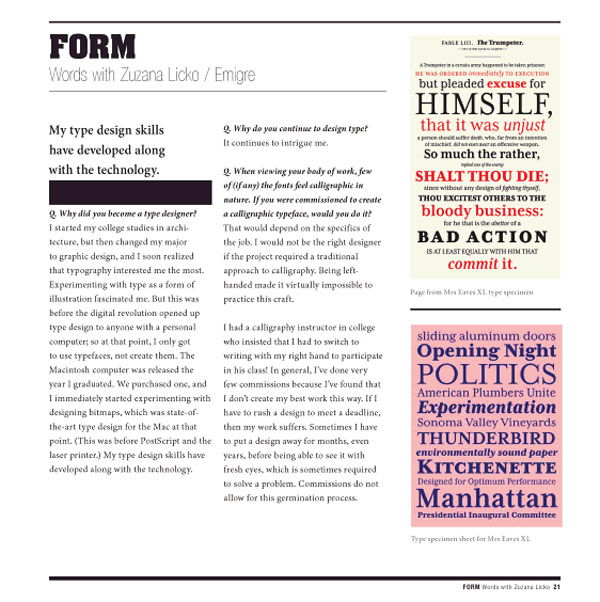
One of the greatest assets of Type, Form & Function which many educational books are weary of using is the use of bad examples. Type, Form & Function isn’t scared to pick examples of what not to do and these lessons become far more valuable than just a page filled with pretty pictures. Each page is delicately crafted there’s no fudging whatsoever going on, the editing and detail has been executed with military-like precision. The information is conveyed in a way that is appealing to its target market of designers. Designers are visual people, and Type, Form & Function is littered with diagrams, real world in-context photographs of typography use and lots more. Type, Form & Function uses a variety of media types to advance this message further by having interviews with professional graphic artists and in even hand drawn sketches.
I have no qualms in saying Type, Form & Function is near perfect in all criterion and I strongly recommend any student graphic designer or any designer in general interested in typography to check out this book, it will be your Bible. Type, Form & Function is a great mix of history, practitioner interviews, technical detail and analysis and superb illustrative exemplification. If I could somehow give this book a higher score I would.
[rating:5]


