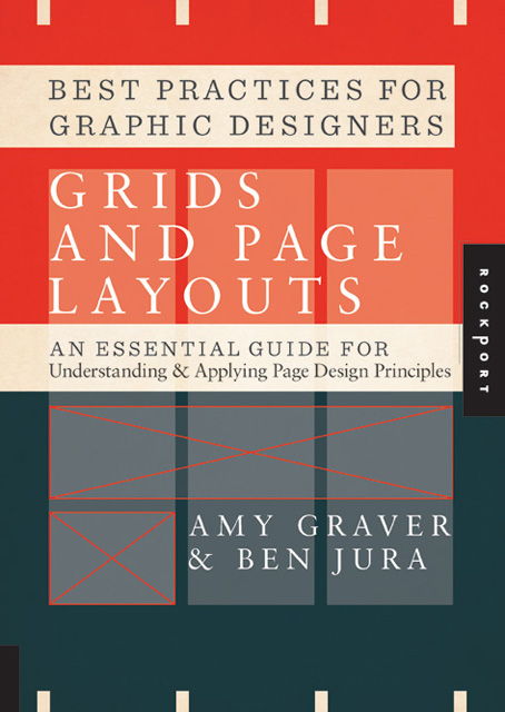
Best Practices for Graphic Designers, Grids and Page Layouts: An Essential Guide for Understanding and Applying Page Design Principles
ISBN: 9781592537853
Best Practices for Graphic Designers, Grids and Page Layouts: An Essential Guide for Understanding and Applying Page Design Principles by Amy Graver and published by Rockport will tell you absolutely everything you need to know about grids and layouts! In this in-depth guide you will learn how to use these tools effectively to seamlessly create structure, order and balance to any communication whether it is on a mobile phone, a business card, a magazine, a newspaper, a report, even a logo! After reading Grids and Page Layouts you will confidently be able to answer the following questions and acquire the following skills:
- When to use single vs multicolumn grids
- Determining hierarchy of information
- Using negative space in your layout
- Symmetry and composition techniques
- Integrating type and images
- Using colour as an underlying Elements
- When it’s ok to break the rules
Written by Amy Graver, the owner and creative director at Elements which was founded in 1999 and regular speaks at conferences and events, and by Ben Jura a senior graphic designer and project coordinator also at Elements and graduate at the School of Visual Arts with a BFA, Grids and Page Layouts speaks with authority and experience. Although the book is nearly 200 pages in length and has a smaller page size it seems to whiz by quickly, most likely due to its large text size and use of full sized images which makes it a blessing to read.
Grids and Page Layouts starts with the essential elements of the grid system and then it explains some commonly used basic structures. The book continues with more in-depth information with the theory of grids and then organisation and hierarchy of grids. Page and content structure teach you how to implement the teachings from a practical level and the relationship between different design components. The book finishes with information on using type as an image (so like logos and headings) and colour utilisation. Graver and Jura convey their message with the right level of enforcement by being dictatorial for the basics and providing the reader/designer with a healthy amount of creative inspiration and liberty when it comes to matters of personal preference and the more controversial topics.
Grids and Page Layouts relies solely on finished works from designers from a variety of studios and not on diagrams, and this is unfortunate as diagrams are so essential to communicating grids. Sometimes the photos miss the message and appear as an aesthetical fill rather than serving any practical purpose. One of great positives of the title is its case studies. One of my favourites include the design and development of the Ipad version of Wired Magazine with its breathtaking layout by Scott Dadich from Conde Nast. The case studies are thrown in between chapters and they don’t seem to correlate with the prior chapter in any way which is bad for those who like continuity and good for people who like to have a break after every section. It goes without saying that the layout is fantastic, it makes the content seem more simple and achievable with its large headings and well spaced typography. Most importantly the instructional aspects of the title are well written. Somethings I really took away from Grids and Page Layouts, and I am sure others will find particularly interesting as well include:
Golden Sections – which is a layout designed from two asymmetric components which form a layout ratio Flow – how typography will affect the flow and readability of a page Negative Space – how and when to use negative space effectively Content Across Pages – how you can utilise full page spreads in layouts
The topics are well suited for beginners all the way up to professionals with the books advanced issues raised above. The book does cover quite a specific area of graphic designer so as part of a collection Grids and Page Layouts is a great resource. For the casual book buyer the title might not cover enough bases for you like typography, colour, design theory, design portfolio ideas/inspirations, photography etc. All in all Grids and Page Layouts is an entertaining reference for designers who want to take control and further improve their knowledge on an area of graphic design that can drastically change the tone and sophistication of any communication.
[rating:3.5]


