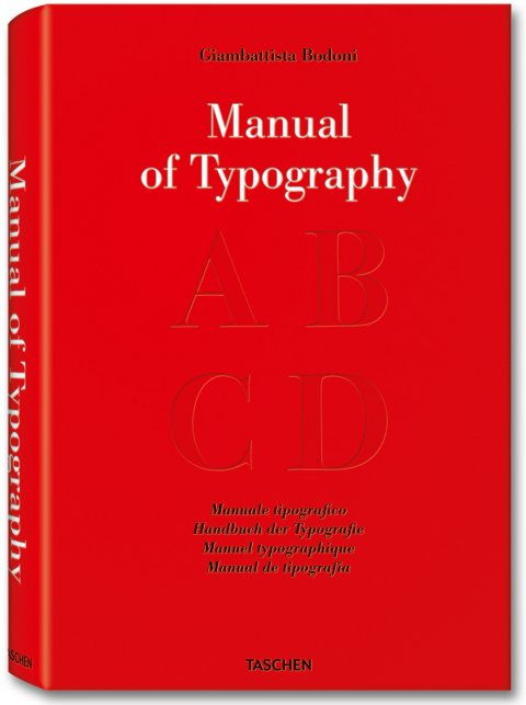
Bodoni, Manual of Typography – Manuale tipografico (1818) – Review
Article by Martin Gibson – @embody3d @martingibson – 12.11.2010
Manual of Typography – Manuale tipografico by Giambattista Bondoni and reprinted by Taschen is a very unique book that we’ve had the joy of glancing over. Glancing over you might ask? Well yes, there aren’t many stunning images in this book, in fact there are none, nor are there many readable words, in fact there are none? But Manuale Tipografico is enormously large; 279 thick pages in fact making it the ideal paper weapon or booster for a child getting a haircut.
The father and most celebrated type designer Giambattista Bodoni (yes you remember that font Bondoni on Microsoft Word) collated a standard encyclopedia for printing the alphabet with Manuale Tipografico in 1818. The encyclopedia was first published posthumously in a limited edition of just 250 and features 142 sets of Roman and italic typefaces, borders, ornaments, symbols and flowers as well as typefaces from different alphabets including Greek, Hebrew, Russian, Arabic, Phoenician, Armenian, Coptic and Tibetan. Bondoni was the official printer for the Duke of Parma, a former small Italian state and Bondoni’s philosophy on type was founded on 4 main principles including uniformity, design, sharpness, good taste and charm. I am sure you would have come across Bondoni’s own creation before with its superb technical refinement which epitomizes purity and finesse.
For historical purposes and as a library piece this book is a must, it is equivalent to Darwin’s ‘Origin of Species’. It is truly one of the most monumental culmination of fonts made by man, which is made all the more challenging by the period when it was collated when cultures and languages weren’t as tightly fused and borders weren’t just a plane trip away. The quantity and depth of the work is outstanding, which not only includes fonts but a wide array of glyphs and formatting elements. This amazing typography encyclopedia is justified by 4 decades of tireless work by Bondoni; this was his career and lifetime achievement.
Closeted in the back of Manuale Tipografico is the key to the book, an extended foreword of the reference material edited by Stephan Fussel. I strongly recommend before you even open Manuale Tipografico that you go straight to this booklet as it will explain in English a background of Bondoni’s life and the typographical influences of his time. It is then followed by letters from the widow of Bondoni, and Giambattista Bondoni himself reflecting on the typefaces which are just a pleasure to read. It’s fascinating to hear Bondoni’s widow fathom the importance of Manuale Tipografico in a letter she wrote to the Princess of Austria:
To Her Majesty the Imperial Princess, Maria Luigia Archduchess of Austria, Duchess of Parma, Piacenza, Guastalla, etc. etc. Your Majesty, In every age, within every nation, there has always been the noble competition to create monuments in honour of those Princes who are worthy of the gratitude of men, to suitably transmit their eminent and illustrious memory to posterity. Statues, paintings, temples by the most celebrated artists, either perished in ruins, or were devoured by flames: but it was not so for the press. This art, the most useful of human discoveries, as it speedily diffuses all other discoveries; this art, that spread all over the world from Germany where it originated, endures fires, vicissitudes, time itself. It alone was able to broadcast the virtues of monarchs, the great deeds of our ancestors, and the ideas of the most sublime minds.
Unfortunately this book despite being revolutionary for its time is only going to lose relevance going forward. We have evolved so much in typography in not only the last 100 years, but the last 20 years; it has been a radical time for typography. Unfortunately for many Embody 3D readers this book may appear dull and lifeless compared to the radical sans-serif, grunge and modern typefaces we have the luxury of choosing from (which ironically derive from Bondoni’s hand). It is the strangest feeling going through page by page of this enormous title, it is as if every page has the exact same font on it. However if one were to go back or forwards 20 pages one would see a substantial differentiation in typeface. You get the impression that someone flicking through this same book in the 1850’s would have a keener eye for detail to this subtle differentiation that modern graphic designers can’t appreciate because of the scope of modern type.
As a reference book this isn’t fantastic. There is no contents, no structure, no captions or justifications… but this I am sure is how Bondoni intended it to be…just a book of fonts. For someone who loves typography this book should be rated a 5, but for someone who finds Papyrus and Comic Sans to be God’s gift to type this book isn’t worth the pages it is printed on. But who doesn’t like history? I am giving this a reluctant 3.
[rating:3]


3 Comments
[…] This post was mentioned on Twitter by Martin Gibson and Embody 3D, Martin Gibson. Martin Gibson said: Bodoni, Manual of Typography – Manuale tipografico (1818) – Review http://goo.gl/fb/qpuEe #featured #reviews […]
another book to be added to the xmas list right here..
Yeah it’s an interesting book, not a bad xmas present!