Graphic Designers Essential Reference
Article by Martin Gibson – Twitter: @martingibson @embody3d – 19.11.2011
ISBN – 9781592537433
Graphic Designers Essential Reference – Visual Elements, Techniques, and Layout Strategies for Busy Designers by Timothy Samara and published by Rockport
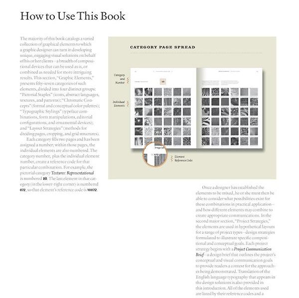
Starts with a good ‘How to Use this Book’ section.
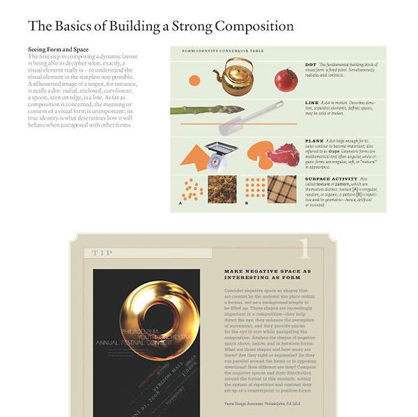
Graphic Designers Essential Reference outlines some essential tools of the graphic designer including a good computer, sable brushes, swatch books with spot and profile colours, gouache, loupe, erasers, steel ruler and tringle, cutting mat, knife, lucite brayer and a bone folder. This is a good section and I enjoy how they note down a lot of traditional tools to be an equipped designer, but they really need to focus more on digital. I know traditionalists are going to hound me on this point but because of time restrictions and the digital way of communication the need for laptop and software is becoming increasingly important. Let me put this way a graphic designer can survive without a set of paint brushes but a designer can’t survive without a laptop. The following educational section I believe is well orchestrated. It teaches in a basic manner the study of form and composition, colour, typography, scale, contrast and hierarchy. Not to mention principles of symmetry and asymmetry and working with photographs or images. The diagrams used in this section are brilliant it clearly explains the core concepts, and the pages aren’t too overbearing. I particularly enjoyed the section on choosing and combining typefaces as this is something I have developed personally by experience but to see a theoretical teaching of it really drew me in.
After this extended introduction of sorts the book then splits up into 2 core areas. The first is all about graphical elements which are illustrated in a swatch format, and the remaining half ‘Project Strategies’ shows how these principles are being used throughout projects.
Graphic Elements Graphic elements is segmented into pictorial staples (like icons, patterns and image treatments), then chromatic concepts (colour palletes), then typographic stylings (fonts and combinations), then followed by layout strategies (like grid structures, cropping strategies and ideas on proportion).
In general the graphic elements section is well composed, there definitely could be more filtering by only showing a couple of the best and more unique concepts. At times the concepts can be repetitive and even at times amateurish. For example the swatches on photography where it shows different filters you can put on photographs seems to follow the ideals of the creators of Photoshop. As in we all know there are some crazy filters in Photoshop, but just because we can mathematically create crazy things it doesn’t mean stylistically we should use them. When would a top design studio ever digitally emboss or solarize an image? The textures on the other hand are great, the colour palletes on the other hand could use some work; some of them just don’t seem to work at all. But perhaps it is just my subjective eyes.
Project Strategies Project strategies is split up into 4 sections like graphic elements, these include: first impressions (cover designs, advertising and website homepages), then setting the stage (editorial spreads, posters and advertising and retail displays), then the heart of the matter (packaging systems, content websites and extended publications), and then finally letter perfect (which is just a selection of typographical solutions).
Project Strategies on the most part is pretty good, I like how on each design it has a ‘visual profile’. The visual profile just uses graphic design buzz words to describe the piece which is actually pretty helpful and unique. For example: continuity, flow, modular, spatial, narrative, layered etc. etc. It is rare that I say this but the quality of some of these works is at times pretty average. I am used to getting design portfolios and books that just blow you away, but just some of these designs you wonder how they made the cut. Don’t get me wrong on the most part the standard is pretty good, there are just a few stray shooters that make you wonder.
Graphic Designers Essential Reference is good but not heart stopping. The educational section is really great; it’s almost a shame it isn’t any longer. It would be nice if they could interweave the three areas of education, templates and real like examples into one section because they kind of bounce well of one another. Although it is pretty weighty and is titled as a reference book it feels like things are just missing from it, for example where are borders or gradients for example? It is by no means a complete reference book but it is sufficient in delivering a good mix of everything. As a present or for design students I recommend this book, for professionals I would recommend a more in-depth title to use as an essential reference.
[rating:4]


