Interview – Andrew Simpson – Vert Design

- advertising
- Andrew Simpson
- Australia
- blower and cold worker
- CAD
- chief designer
- China
- designer
- Embody 3D
- fashion
- feature projects
- form
- founder and chief designer
- founder and head designer
- General
- goods
- idea
- industrial design
- industrial design degree
- machinery
- managing staff
- manufacturing
- product designer
- quality product
- Sony
- Southeast Asia
- Sydney
- USD
- Vert
- Vert Design
- What college
- work
- www.vertdesign.com.au!
In this extended interview Andrew Simpson, founder and chief designer of Vert Design based in Sydney will outline some of the feature projects of his studio as well as give an insight into the current state and future of the Australian Design Industry. There is also a couple of questions for students so be sure to read these to start polishing off that portfolio of yours. I hope you enjoy the interview and be sure to check out some of the work of Vert Design at www.vertdesign.com.au!
Article by Embody 3D – Twitter – 05.03.2010
General Questions
Hi Andrew welcome to Embody 3D and thank you for taking the time to talk with me today. To get started could you please give me a quick introduction to yourself?
I am the founder and head designer at Vert Design (pronounced v-air design) a design house. I think the distinction between a studio and a house is that a design house is also involved in the production and sales of our works as well as taking on design work for other companies. I employ 4 other designers and work for companies like Sony as well as small start up businesses.
Could you tell me about some of the challenges in establishing your own design studio?
The hard bit is that a design studio is in reality just a small business. Design and producing products is the essay bit. It is the accounting, contracts, lack of scale and managing staff that is hard. The fact that our studio is a business and we go through the same process as our clients allows us to have real empathy with them and to anticipate the impact of our designs on their operations. Empathy is key to good design and is the opposite of arrogance.
Student-Related Questions
What college/university did you attend for you Industrial Design degree and what was your experience there like? How do you feel some of the classes prepared you or didn’t prepare you in working in the design industry?
I studied at UTS. I was not a great student and just did the minimum to get through. But I made the most of being in a learning environment by attending lectures for other subjects, visiting other faculties and spending hours drawing and making products. I was working as a glass blower and cold worker while I was a UNI and I guess that I was more interested in real world design then the hypothetical projects that we had in class. I still use a lot of the tools that we were shown at UTS and a lot of what we learned has much more relevance to me now.
When a student submits their portfolio/CV at Vert Design, what do you look for in an applicant? Alternatively do you have any pet hates or information students should avoid in their portfolios?
I have one pet hate and that is portfolios that are over 5 Megs. A design should be able to resize their images to screen res. I get sent around 10 portfolios a week and they start to clog up my laptop.
With a folio I am generally looking for clear communication of a design ideas in some form (drawing, cad, physical model or Photoshop renders) and I am trying to see that there is a logical progression from idea to finished product. Over the years I have noticed that the longer the explanation the worse the design so I am looking for work that is clear. I also want to see flexibility in style to suit different types of products.
Do you have any general advice for students who are studying industrial design? What skills should they develop and learn?
My advice to all students that come to see me is that you are what you do. So if you want to be a designer you should be designing products. I get a lot of students that come in and the only work in their folio is what they have done at UNI. My other advice is to draw all the time, draw what you see around you, things that you like, details of products, animals and ideas. That way you start to understand how things work visually and you will develop a quick way of communicating. Drawing is a great way to really see and understand things and is part of the designers tool kit.
Design Related Questions
What would you consider to be the best and worst aspects of being a product designer?
The best aspect is the depth of social understanding that you get. As designers we get to work across a huge range of professions and tasks. In the last mouth I will meet with business owners, factory staff, engineers technicians, marketing people add agencies, polymer chemists, artists, venture capitalists, IP lawyers, graphic designers, interior designers, architects, politicians and crafts people. When your work is good everyone is happy to see you.
The worst part is seeing good ideas get rejected for the wrong reasons
Are there any iconic designers that you use as inspiration or mentors that have guided your design philosophy?
More and more I have been inspired by people from other industries like advertising and fashion. I see that a lot of designers are caught up in talking about the problems in the industry instead of just getting on with it. Creative’s in advertising seem to believe more in what they do and can there make great things happen.
What is the typical design process you go through to create products at Vert Design?
I have been using a new technique of creating a character and imagining how they would use the product, or having them be in a space an describing that they see. It is a very good way to quickly empathize with the user and find out what they need. It also removes me from the idea, which seems to help the creative process. We use cad and hand models to resolve our forms and to get proportions right
What are your thoughts on the current state of the design industry in Australia? Has it changed? Where is it heading?
There are a few conversations that Australian designers don’t seem to be having. The main one is that a lot of people are designing only what they think that they can make themselves. That is what I see when I look at Australian design showcases and what the international design scene does not understand. I think if we start to embrace this fact we will be able to take positives from it and build on our toughness and depth of knowledge that we have had to had to get this far.
There are many big opportunities for Australian designers and we live in a time where creative thinking is very valuable but it is up to the individuals to work hard and make them happen. If you are a designer with a great idea or product, no one is going to come and discover you and there is not some magical manufacture that is going to come down from the clouds and start paying you a royalty. You will need to make all this happen yourself, so form good partnerships and learn about business.
Could you tell me about some of your latest projects and focus at Vert Design?
Not really we sign a lot of NDA’s but take a look at our web site
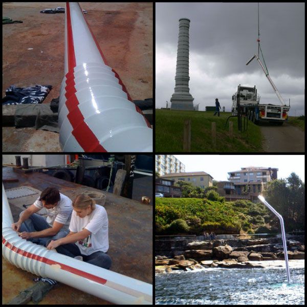
The Big Drink concept exhibited at Sculpture by The Sea is an artistic piece that showcases the irony of Australia’s lack of drinking water yet being completely covered by the ocean. These types of artistic statements are normally never conceived by industrial design businesses. What was the motivation for venturing into these new artistic spaces? How do these types of projects shape the Vert image?
Art seems like a natural part of being a designer.
Some of the Vert projects have a real novelty about them, or a real sustainable crafty feel like the MC Mallet. How important is sustainability to the pieces you develop at Vert Design?
We treat sustainability like safety. It should be a given and only really noticeable when it is not there. Few products are sold on safely alone as it is expected and we will need to get to this situation with sustainability soon.
Part of the problem is that sustainable design is very complex and the decisions that a designer has to make are complex. The only way to practically implement sustainable design is to go back to the 3 R’s; Reduce, Reuse, Recycle,
Reduce – can you do without this part? Can you make it lighter? Can you replace this with a service?
Reuse – can you extend the life of this product? Can it be made for Reused or recycled material
Recycle – have you designed for disassembly? Have you chosen materials that can be recycled? Are your materials labeled?
In Australia there seems to be a growing trend of outsourcing manufacturing to China and Southeast Asia because of lower labor costs. What are your experiences/thoughts on this growing market trend?
I think a lot of people do look at the real costs of out sourcing there manufacturing, Advantages of manufacturing in Australia of a local market
1-No international shipping costs
2- No import duties
3- No holdups on customs
4- Better quality product
5- Easier quality control and returns on faulty goods
6- Smaller volume orders are possible
7- Flexible order sizes/colours
8- Customer support for Australian made products.
9- Face to face problem solving with no language barrier
10- No risk of sudden price rises due to changes in the Aus dollar
11- Less Carbon emissions from shipping.
12- No need for shipping insurance
13- Local manufactures will help you to improve your product and often become staunch advocates.
14- No knock off products/ protection of IP
15- Consistency in product
16- It is often not more expensive as the commodity prices on raw materials and machinery are international. It is only labor that costs more in a western countries (as cost of living is higher, fuelling a robust economy). However most manufacturing can be fully or partly automated reducing the labor component of a manufactured cost.
I think a lot of people like to do business offshore as they feel less guilt about driving a hard bargain with someone that they don’t have to put a face too. Also they can blame someone for there problems ‘the Chinese stuffed it up’ not ‘I didn’t provide the proper specs for this job to be done correctly and I didn’t take the time to make sure I was understood.
Manufacturing was the first sector to be hit hard by off shoring and other industries are following. It is now possible to offshore most business tasks to south East Asia at a fraction of the cost of doing it locally and as different industries start to feel the pain of this attitudes may change.
Andrew thanks for taking the time to talk with us here at Embody 3D. Do you have any last thoughts for the Embody 3D readers?
I have opened a pop up shop but it is only around till mid May. The store is at 281 Clarence Street, Sydney CBD, NSW 2000 and the hours are Mon-Fri 11-6 Sat 11-5 Sun and Public Holidays closed. We are in arcade 1 (first on the right). There is a great coffee shop in the entrance and a gallery up stairs.
The shop tucked away behind the QVB so people will need to know about it to go there. We will be changing over the stock every couple of weeks and have been making some new works just for the shop so I hope you can get down to see it.
Embody 3D is proud to promote and support businesses in the Australian design industry. If you would like your design business to be featured on Embody 3D’s interview section, please send an email to [email protected]



11 Comments
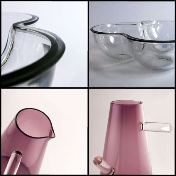
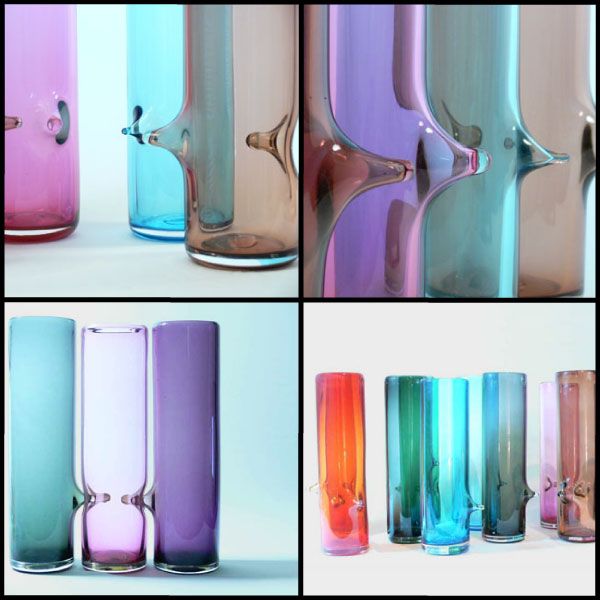
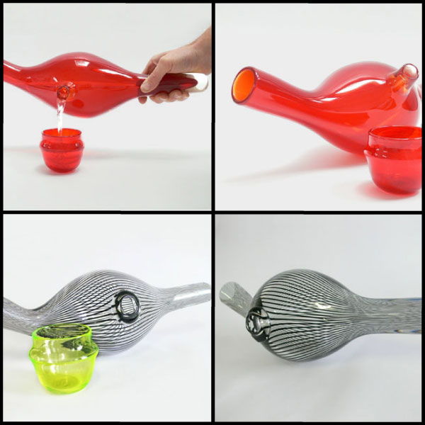
I love the glass work especially the clear and black striped one it is such an intricate and amazing pattern!
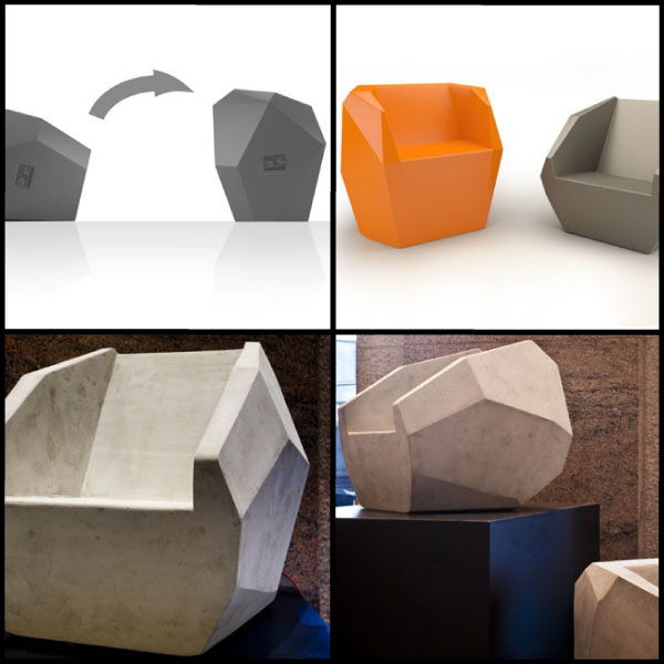
Agree the glassware is fantastic. I wonder how much it costs, the chair design is pretty stealthy looking. Would be pretty cool as like the ultimate gamer half-life/modern warfare game chair!
that huge straw would have been heaps of effort, top work just for the effort, what is the straw made out of (out of curiousity)?
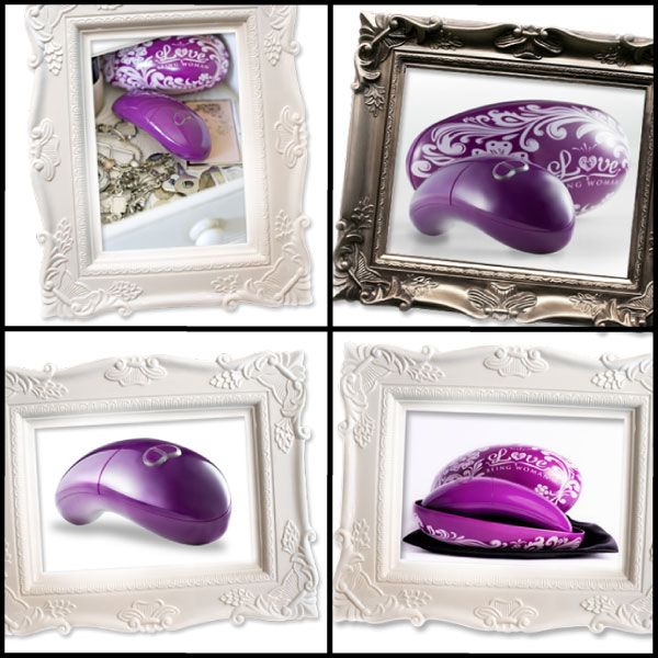
I don’t exactly understand what that purple thing is in the picture frames..it looks cool but I can’t quite figure it out. It looks like a computer mouse or like a massager or something?
Hey Shinha,
Your actually correct it is a massager, good guess!
You can find more specific information about this product at Vert Design’s website here:
http://www.vertdesign.com.au/index.php?/pieces/love-being-woman/
off topic – but what’s the deal with the Embody 3D logo change?…………………it’s all pansy looking?
lol I am glad someone noticed the change! Have no fear the change in the logo is for St Patricks Day which is coming soon. We are actually going to change the logo for every major event of the year. Yes I know it’s a complete rip-off from Google but hey why not?
I also came under the impression the chair would be a gamer chair it definitely has that aesthetic.
Deary me that massager is looking a bit kinky, kind of like the new Sony Playstation Move!
There is something strangely sexual about this glassware. Like look at the 3rd image it is like a threeway with male and female water jugs/vases. It is marvelous I would buy them as gifts and to have a laugh. Did the designer have this in mind or am I just being a sicko?
I like this post, enjoyed this one appreciate it for posting.