The Theory of Logo Design

- actual product
- advertising media
- advertising mediums
- Apple
- arts and craft movement
- Australia
- based media
- Burger King
- Business
- Coca Cola
- colour
- Disney
- Embody 3D
- FedEx
- globalisation of markets
- industrial design
- laser printer
- Logo
- mass products
- McDonald's
- media
- Nike
- pretty straight forward
- product designer
- product designers
- search directory
- shape
- social media
- software/applications
- Starbucks
- text
- trouble printing gradients
- web graphics
- web material
In this post I will talk about what a logo is, what they do, how they should be designed, protecting logos and logos in relation to product designers. I will be talking about logo theory in reference to a logo for a business, not an event logo or product logo, although some of the lessons will be transferable.
What is a Logo?
In short a logo is a graphic symbol that represents a business.
The Importance of a Logo
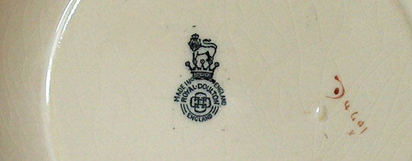
Logos, marks, symbols, seals, emblems, insignia, badges and hallmarks have been used since the development and trade of mass products. The purpose of logos to some extent has changed over the last 2 hundred years. Originally logos were used to represent quality of a product, and to attribute this quality to a particular name or maker. They were also used to authenticate the maker and source of a product. For example genuine Royal Doulton ceramics have the iconic Royal Doulton makers mark on the base of the product.
Another purpose of these brand marks was for the maker of the product (particularly in the arts and craft movement) to have the recognition and pride to always be connected to a product on an emotional level. So even though the product will no longer be owned by them they will always still be a part of it.
However with the explosion of the industrial revolution and today with the globalisation of markets, logos are essential to just distinguish between one product/brand and another. The design of logos is critical to present an image of your business and to help build its branding strategy. We often remember logos more than the actual name of a business so it important that stylistically it fits within your business image. It is important to note however that a logo isn’t a brand, but it helps represent one.
Varieties of the Modern Logo
The modern logo of a business should be used on a variety of advertising mediums including business cards, letterheads, web graphics and print material to provide a consistent and identifiable image for your customers. Logos take on 4 types of forms which include:
Text Only Logos
Badge Only Logos
Text and Badge Logos
 There is no rule as to which type of logo you should choose. However the text and badge logos are the best type of logo for small businesses and badge like text logos are not too bad either. The advantage of badge and text logos is that you have the choice of what type of image you want in different mediums. On web material you might want just the badge, but on printed material you may want the badge and text. But it is critical to understand where and when to use these different varieties of your logo as it may distort the unity of your brand image. Having a badge only logo for a small business is a very bad idea. For example if you have a badge containing only the letter ‘w’ it gives no information to your customer to be able to track down your business or service through a search directory. Only market leaders with highly recognisable logos have the luxury of using badge only logos like Apple and Nike. Be weary of the proportion of your logo, whether it be landscape or portrait. Portrait logos tend to be more difficult to transfer to different media and it may require the adjustment of being able to work in a landscape mode as well.
What Does a Good Logo Look Like?
The biggest question people seem to ask is, what makes the logo of companies like Apple, Disney and Nike just so iconic? Is it the great design of the logo? Is it just because the products and services behind the logo are just so good? Or is it because we are visually bombarded by the logo so much that we just think it looks good? The answer to this question is a combination of these factors. There is nothing graphically brilliant about the Apple, Disney or Nike logo. The real brilliance behind these logos is their shear saturation of the logo in the world around us and the great products that drive them. In retrospect the design of a logo isn’t extremely important in the grand scheme of things. People wont flock to your company because you have a nice logo, and it is likely customers will still come to you even if you have a hideous logo. A good logo will just increase the quality and succinctness of your brand.
Tips on Logo Design
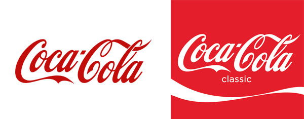
- Make sure the logo works well on a theme colour background. For example the Coca Cola logo works well on both the typical flat white as well as on a red bottle label. This can normally be simply done by just inverting the colours, but you will find some logos might not look good when inverted.
- Make sure your logo is unique. This goes without question, the more unique the more you are distinguished from your competitors. But be careful not to make your logo too crazy, stand out – don’t stick out. Don’t use standard fonts like Helvetica without any variety applied to it as it makes your logo easy to be replicated by others and suggests that you have not been bothered to spend some time and money generating a nice logo. For example the design of the Starbucks logo could be considered highly unique aesthetically.
- Keep it simple and easy to read. Don’t make your logo really busy filled with different fonts and colours as it will just confuse your target audience. Busy logos tend to be over-designed or can appear a bit old fashioned. Remember simple is always in! Ensure that if your logo uses a script or grunge font that it is easy to read.
Ensure your logo looks good at different sizes. This might seem pretty straight forward but some logos look great at normal size, but when scaled down look terrible when on letterheads or business cards. The fonts most vulnerable to this phenomena are fonts with thin lettering. For example Helvetica Neue Ultra Thin can almost disappear into the background completely at a small scale but when at normal size it can look very elegant.
Creating space balance. Look at the spacing between letters, words and graphics. Make sure the spacing is consistent between letters and words. Logos that are busy on one side and barren on the other can sometimes look unbalanced. A good way to test for this is to tip the page upside down and observe the overall formation of shapes. The balance of shape and colours should appear a lot more vividly when viewed upside down without the bias of your eyes natural reading habits.
Using hierarchy. Ensure there is a hierarchy of shapes and colours. There should be (but not always) a clear hierarchy of colours including a primary, secondary and any additional colour layers. For example the Pizza Hut logo has black as a primary colour, red as a secondary and yellow and green as a close third colour. However if you look at the Google logo above there is no hierarchy in colours and it makes it somewhat difficult to interpret/prioritise where to look first.
- Consistency in shape. Make sure that there are no clashing shapes in your logo. If your lettering has sharp edges it is probably a good idea to have sharp shapes to supplement it. For example the Burger King logo has letters with a small fillet applied and this fillet is also applied to the bun shape graphic to create a harmonious, soft look.
Design for longevity. Although it is sometimes appealing to pick up on fads of a particular target market it is not a good idea to adopt this in a logo. For example in the 80’s and early 90’s there was a huge fad in the graphic design community to use all things grunge. Although grunge still has a valid purpose it is probably not a look that will appeal to generations to come.
Be theme appropriate. That is, design for the company you are. If you are a professional consultancy make your logo smart and elegant. If your a cool surf business make your logo a crazy wave with large sloped text. Make sure the logo gives an insight into your businesses culture, attitudes and image. Once again on the Google logo, how does the babyish, colourful, drop shadowed text reflect the modern, innovative, diverse company Google is?
Use smart colour schemes. Sometimes a business is stuck with their company colours and these can not be changed. But often when we design logos we are designing for new businesses, so give the business a colour scheme that works well together. For example, FedEx’s orange and purple famously work well together. Orange and purple don’t go very well with other colours, particularly purple, but they just seem to work well.
Think about text. Hopefully the business has a good, short and unique name. If possible try to avoid small descriptive text on a logo. But for a new business, or a business with a name that has nothing to do with the products and services they provide, descriptive text may be necessary for the customer. Try not to put company slogans in the logo. Although it may be appealing to do so, I challenge you to think of one multinational company that has a slogan in their logo?
12.Type of logo. In the previous section I mentioned the different types of logos available. If your business is a web based business, social media business or a software/applications business, it is best to use a badge and text logo. If possible try to make your badge a letter or a very primitive symbol that highly captures your logo. This badge can be extremely important for iconography purposes, this can include favicons or application icons on iPhones and other packages.
Avoid gradients and drop shadows. Gradients can sometimes be an excellent way to put some extra buzz into a logo. But just be weary that some printers have trouble printing gradients smoothly, and also web based media can often put streaks in gradients. Most of this can be avoided by being smart in how you save your file type, that is, what file type and quality you save the file as. Avoid drop shadows for stand-a-lone logo, they just don’t look good and the same goes with inner/outer glows. Incorporating these graphic features for your logo on advertising media is absolutely fine but they can look tacky when scaled.
You should always have a grayscale version of your logo which is optimised for best viewing when printing in black and white. Many businesses doing thousands of photocopies of project reports may not be able to read your yellow coloured logo when printing on a laser printer. So turn your logo into a grayscale version and then tweak the colours as necessary.
Protecting a Logo
Many people are completely puzzled on how to protect a logo and the regulations that govern graphic works. To make things clear once and for all, any graphic work including logos, under Australian law is automatically copyrighted. There is even no need to put a copyright symbol at the bottom saying copyright, year etc. To be able to enforce copyright infringement you require proof that you originally created the graphic. It is always a wise idea to document the generation of the logo internally.
Now onto the trademark issue. Trademarks are used to protect the name or symbol of a business so that competing businesses can’t use the same or similarly styled logos or trade names. For example McDonald’s has a trademark on their business name and the famous golden arch. If another burger franchise called themselves MacDonald’s, or if they used a large M that is similar to the golden arch, McDonald’s could enforce their trademark on the business in question and would likely win. To get a trademark for your logo or business name you must register for one through IP Australia. More information on trademarks can be found on their website. Trademarks in the real world are only required for large businesses or where their name has taken on the name of the industry, for example, Esky. Esky is actually a name of a business that make portable ice boxes, the actual product isn’t called an Esky, but they are so prevalent in the market we just call the product an Esky.
Businesses with a registered trademark will have the small ‘R’ symbol on their logo. If a business has the letters ‘TM’ on their logo it means that they intend to one day apply for a trademark or they are currently using the logo for trademark purposes. By default a lot of businesses just have the ‘TM’ symbol on their logo just to assert their intent, but this is by no means compulsory or necessary. Putting a copyright symbol on a logo is completely pointless and destroys the simplicity of the design, do not do this ever. I must vindicate that the above rights on intellectual property are the Australian standards and overseas countries may differ in how they regulate these matters.
Logo Design for Product Designers
Logo design for industrial designers should be kept really simple. It is best to use a clean and simple font with your name. Badges are fine but are probably unnecessary. As a product designer you really want your portfolio of products to do all the talking not your logo, so for this reason make sure your logo isn’t distracting.
Please list any suggestions in the comments and I will add it to the list!


16 Comments
what about banning the use of Papyrus and Comic Sans as typefaces!?
great article though!
logo is an important thing for business identity.
Hey.. yeah its right that logo plays an important role but i believe that a logo makes its own identity when it gets huge traffic. Same thing is happened in above brands.
you need more information on product design logos I think
I think the Disney logo is the best designed logo of all time. But as you said what makes a good logo?
GOOGLE HAS A BAD LOGO BUT THEY ARE HEAPS INNOVATIVE IN HOW THEY ADAPT THEIR LOGO FOR SPECIAL EVENTS. IT IS SUCH A GOOD IDEA
yeah i like how google changes their logo for special events. i am trying to think of my favorite google special event. i liked the recent sesame street one! totally mad!
Coca Cola has got to be the most prevalent logo of all time – no debate about that one
omg~~ tell me about it no papyrus. i watched the movie avatar today and for the subtitles they used the font papyrus! what were they thinking!!!!!!!!!!!!!!!!!!!!!!!
[…] The Theory of Logo Design […]
Logo’s I think are really important the the business, because it is the first thing that consumers would look onto. Logo’s is what the people would recognize first.try here
Your blog is pretty good and impressed me a lot. This article along with the images is quite in-depth and gives a good overview of the topic.
The author of embody3d.com has written an excellent article. You have made your point and there is not much to argue about. It is like the following universal truth that you can not argue with: The most embarrassing thing you can do as schoolchild is to call your teacher mum or dad. Thanks for the info.
Heya this is somewhat of off topic but I was wanting to know if blogs use WYSIWYG editors or if you have to manually code with HTML. I’m starting a blog soon but have no coding experience so I wanted to get guidance from someone with experience. Any help would be greatly appreciated!
They might be a good fashion declaration at home however, not in Spain. Surgical treatment for Gynecomastia is considered the fastest and most effective way to reshape the male breast. I picture a white light swirling around me, and see myself smiling and happy as I say to myself, “I am Happy, I am Healthy, I am Wealthy, I am Wise, I am Light, I am Love.
my webpage … spray tans how long do they last
Hi, The first one FedEx is not a simply text logo but it represents a best simple example of a white colored forward arrow in its Ex which convey its meaning too. Its a negative space type of typeface logo. A similar treatment I have given to my logo for my website also. However its a knowledgeable article. Thanks