Aesthetic Motifs in Products

- air vent
- Apple
- Breville
- budget product
- CAD
- car polish
- chair
- comedian
- concept car
- craftsman
- Delicate/Minimalist This carbon fibre minimalist chair
- designer
- Durability
- electronics
- Embody 3D
- great industrial designer
- Herman Miller
- identical rubber bases
- industrial design
- Industrial Designer
- judgements on how that product
- Logo
- look
- machinery
- manufacturing
- Marc Newson
- Martin Gibson
- metal plates
- metal tear drop
- microwave
- mouse
- product designer
- product evaluations
- scratch-able gloss paint
- screen
- sound judgement
- standard office chair
- talented product designer
- unjust product
When we observe an object with our eyes we make immediate judgments on what the objects function is and how it behaves. We also make judgements on how that product is positioned in the market. Does it look like a premium or budget product? Does it look modern or traditional? Does it look like it can last? Will I be proud to show off this product in front of my friends? These are often the very important subconscious questions that get asked by users at a point of sales level. The power of aesthetics on consumers can never be under-estimated.
Article by Martin Gibson – Twitter – 06.02.2010
Aesthetics is like a clever lie designers use.
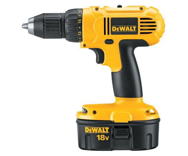
That is, good aesthetic design has the power to make a product appear durable, appear modern, appear highly functional and technological when in fact this aesthetic portrayal has no implication on the performance or core value of a product. It could be said that designers can use these aesthetic motifs to trick consumers to make unjust product evaluations. But this is of course the job of a great industrial designer; a designer that is handed a box full of electronics and is instructed to make the circuit boards sell as much as possible. I still remember as a kid picking toys that seemed to look really cool in the toy store, but after taking them home I remember being bitterly unsatisfied about its function. So therefore it is of pivotal importance to defamiliarize yourself with your designs and ask what aesthetically they are telling you. For example the below DeWALT drill is an excellent example of aesthetic styling that doesn’t enhance the functionality or durability of the product. Yet when the majority of the market sees this drill at a hardware store they will make sound judgement that it is extremely durable.
In fact if we deconstruct this drill further we learn that in some instances there is an overlap between form and function. For example if we take the air vent on the side of the drill with its small radii it screams machinery aesthetically. Yet these air vents play an important role to prevent the drill from overheating and the size of the vents has been purposely considered to prevent human extremities entering them. However if we observe the slightly extruded ridges with their rounded, yet controlled shape, we can ascertain that these contribute no additional functional value (although it could be argued that these give more strength to the form). Yet it is these non-functional highly stylised components that will likely help formulate a judgement of the products durability. Many consumers are likely not to recognise the thick injection moulded plastic with skeletal supporting ribs on the inside. This is why it is important to understand common visual motifs that tell a story to the consumer about what your product represents.
Some Common Motifs
Below I am going to examine some products in how they symbolise certain aesthetic motifs.
Simplicity
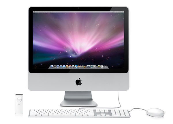
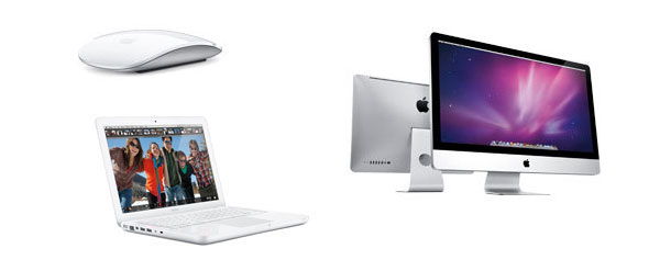
For many users the task of operating a computer can be a disconcerting experience and what better way to sell a somewhat complex product than wrapping it in an eerily simple aluminium casing. The Imac compared to the physical design of other computers appears to be more of a household appliance like a toaster rather than one of the most capable machines on earth. How does the Imac achieve this? Firstly, the stark black frame around the screen is the only great colour contrast in the whole product which gives a visual cue to look at it, it is almost inviting you in. The surfaces (apart from the mouse for ergonomic reasons) are extremely simple and flat which is easy to grapple and comprehend. Important input controls and the CD/DVD-ROM have been hidden to the underside and side of the screen to make the forward appearance deceptively clean and simple. The whole product is monotone and the small contrast between the plastic keys and aluminium frame of the keyboard almost blends them into each other in this gray scale warp. Of course Apple could have put a complex word featured logo but instead have gone for a simple Apple logo beneath the screen.
Durability
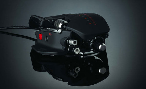
The Mad Catz Cyborg Rat Mouse that we featured in our CES 2010 post is a great example of accentuating durability through industrial design. This mouse is a serious piece of engineering and could have used a nice clean shell to simplify the mechanics underneath. However the industrial designer has chosen to reveal the mechanical makeup of the product to give a real hardcore engineering feel to the mouse that is likely to have good wear and tear. Other aesthetic features include the matte powder-coated finish rather than a scratch-able gloss paint. Unfinished surfaces seem to give a real rawness to a product it is like this product is just a bunch of bones without any skin that could potentially get blemished.
Soft
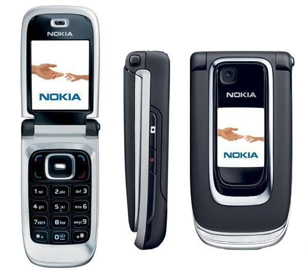
A very popular phone by Nokia is the 6131, which was particularly desired amongst female users and the elderly. The 6131 is extremely curvaceous, barely containing any serious right angles apart from the central swivel joint. Everything about this form is soft with nice large radii around the buttons and of course the overall shape which is like a clam. A popular aesthetic stereotype is that women seem to be attracted to soft forms whereas men tend to confide in sharp or faceted faces.
Organic
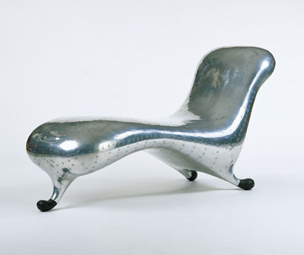
This controversial Marc Newson chair is a great example of organic design. It is as if someone had moulded a metal tear drop and made it somewhat suitable for sitting. But whether you think Marc Newson’s chair is hideously unsustainable, plain uncomfortable, manufacturing-wise unfeasible, it is a perfectly organic. Of course when we say an objects form is organic we are not suggesting it is good for the environment rather we are stating that the form resembles shapes in the natural pre-human world. For example a hammock might look like a leaf or maybe a vase could twist and twine like branches of a tree. To make something appear organic we have to remove primitive prisms like triangles, and use complex rounded lofts (how many times do you see right angles in the wilderness?). Another great trait of organic design is irregularity. When you observe a tree every branch is different from one another, and there is no such thing as a dead straight line, they are filled with imperfections and irregularities.
Futuristic
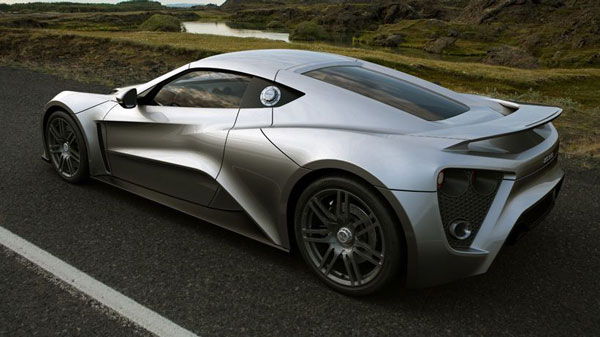
This concept car is a great example of futurism. There are many different interpretations as to what futuristic industrial design looks like. However the mainstream western ideal of futurism appears to be a controlled organic look. That is, forms that are complex, semi-organic, yet have specific geometry and control applied to them. This car is a great example of this complex geometry, yet is is controlled through symmetry, small chamfers and the meshing together of the metal plates.
Delicate/Minimalist
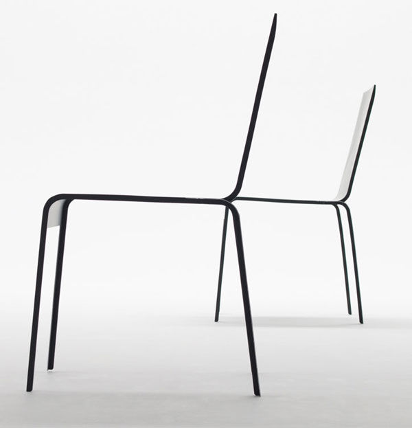
This carbon fibre minimalist chair appears frightening to sit on but is apparently quite secure. Minimalism attempts to use the bare minimum to carry out the function of an object, it is true to form follows function. Minimalism is sometimes criticised for being too simple, but to many space seems to be a luxury these days, and if products can accentuate space in interiors it could only be praised for this. Minimalism of course has great environmental benefits when it comes to material usage.
Humorous
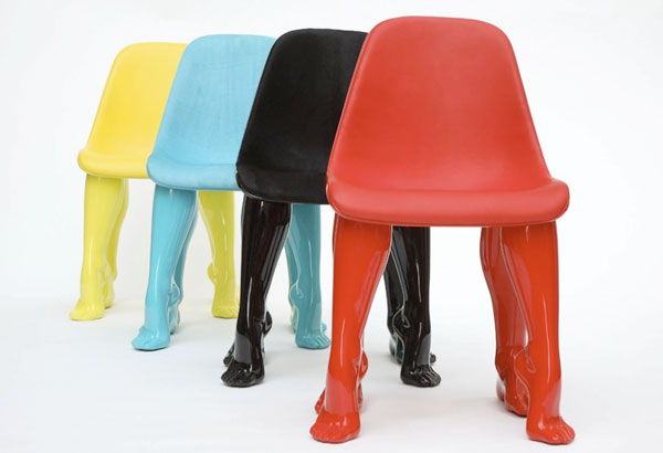
As products are created by humans they can often materialise the vastness of the human psyche and tell stories or in some cases tell jokes. We can have chairs that can just support our weight but what about chairs that can ignite interesting conversation as a guest walks into your home confronted by a four ‘legged’ chair? Humour can be created through personification, story telling and many other avenues I am sure a comedian could tell you. How many times have you seen a kettle that looks like an elephant? What about a mug with a funny story on it? Or what about a product that is purposely not finished?
Geometric/Rigid
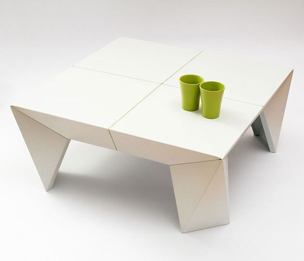
The geometric look is one design avenue associated with the modernist design movement but can be traced back to cubism art or art deco in certain regards. The geometric look is easy to create as often it is simple to draw straight lines and model sharp prisms in CAD. They are also often easier to manufacture as raw materials come in right angles and on flat planes. The style comprises of strictly flat surfaces made up of two dimensional shapes like triangles, squares, rectangles, hexagons and so on.
Complex
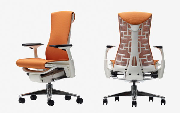
Sometimes you purposely might want your product to appear artificially complex. Take this Herman Miller chair for example, a chair that could be argued as being over designed by minimalist due to the unnecessary under-carriage of the chair, the amount of components and the shear complexity of some of the shapes going on. But to many this chair is a highly desired piece of furniture because it has embodied intelligence. It is as if this chair could take you to the moon and back but in reality it has the same adjustments any standard office chair contains.
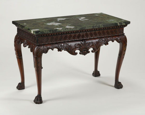
This kind of desired complexity traces back many hundreds of years to when furniture design was undertaken by highly skilled craftsmen. Often a craftsman would put their heart and soul into a piece and make it as complex and intricate as possible as this is the aesthetic valued by these generations, the aesthetic of time and labour skill.
Creating a Visual Identity
Just like marketeers and graphic designers can saturate their products with a visual brand logo, industrial designers can saturate products with form cues that make them distinct from one another. I like to think of these visual cues like the musical concept called ‘theme and variation’, that is, experimenting with a main riff by improvising and soloing. Take the below Breville toaster range, both unique products yet they hold the same visual ancestry. The similarities of the toasters include identical rubber bases, the same fillet applied to the front surface and identical logo and button types.
I am often criticised for praising Apple and their industrial design but you must acknowledge the common visual cues found throughout the whole Apple range. When one walks into a computer store it is strikingly obvious which computers are the Apple ones and which ones are the ‘other ones’. Creating a visual identity for your designs, a design range or for your consultancy can be a great way for consumers to recognise your products without even having to read the fine print.
Despite this additional recognition you may receive from consumers, this visual identity can work against you if your product is of poor quality. It is like a consumer saying “never buy that car polish that is in that big black high-gloss container with the purple sticker on it” kind of thing. Another downside of creating a brand identity through industrial design is that sometimes consumers in some markets can be quite timid and lack inertia to change to anything different to what they have been using for 20-30 years. For example a revolutionary design aesthetic for a microwave might frighten users because they are used to microwaves always having a certain look and feel. Particularly older people take the assumption that they must re-learn how to do something even if a product has changed purely its visual identity (remember earlier how aesthetics has a lot more power than aesthetics alone).
What is Good Aesthetic Design?
It doesn’t matter what style you choose to adopt in your products, whether you choose to be traditional, minimalist, or create a fusion of multiple styles or even create a totally unique aesthetic. The main point of industrial design is that whatever stylistic traits you choose to promote in your designs, they should be equally welcomed and adopted by your market. This is the distinction between industrial design and the arts and crafts movement.
A skill of a talented product designer is being able to use aesthetics in a functional way. This could include making an aesthetic feature out of something mundane and ordinary like the air vent or trigger button on the earlier electric drill. Perhaps your products handle needs to have some ergonomic features to make it more conformable, and clever aesthetics may help you resolve this morphing.
Good aesthetic design legitimises a product as being well considered, professional and a resolved piece of design from the start of the product development process. Gone are the days where engineers collate technologies and enclose it in a black box. In the 21st century this type of ‘throw it all together’ design aesthetic screams to the user that the product was developed as cheaply and quickly as possible. This will leave your audience in a constant state of distrust and lack respect for your product every time they use it.


8 Comments
very detailed, nice overview on aesthetics
Social comments and analytics for this post…
This post was mentioned on Twitter by embody3d: New Blog Posting, Aesthetic Motifs in Products – http://bit.ly/9nFy8t…
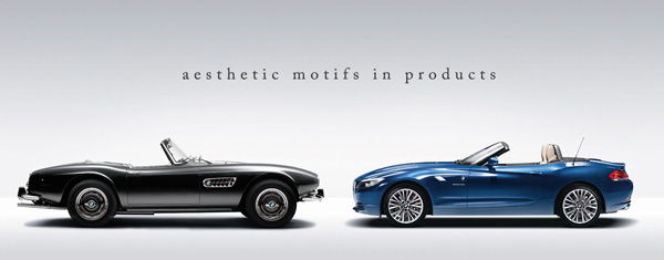
Sorry to not actually comment on the post, but might I say the BMW ont he left of the post picture is amazing. I would love to own that!
I came across this blog from a friends twitter. These articles are fantastic you could almost turn them into a textbook or something.
Hey Ron,
Thanks for the comment. At the end of the year, after I have enough content I hope to bring all the posts together and create a an ebook for Kindle, Nook, and Iphone/Ipad. Thanks!
This whole article is pretty self explanatory but for students it is a gem. I think it is important for designers to create their own unique aesthetic. So much in industry you see the same aesthetic traits carried across multiple brands. I think this article encourages people to experiment and look at these aesthetic decisions more carefully.
A very interesting article, is it ok if i pass this onto my D&T students?
I am a product designer from Egypt it is great to see people writing about these topics. Product identity is so critical and I think this is the foundation of Apple’s success.