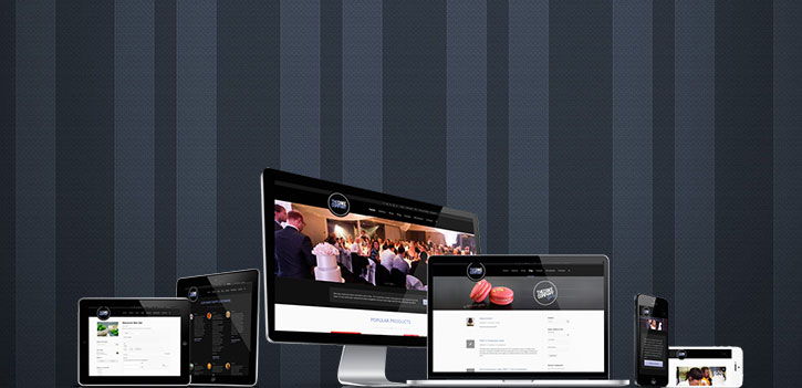
Responsive Websites for Mobiles, Tablets & Desktops
What is Responsive Design
The new craze sweeping the design world is a website design strategy called responsive design. Responsive design is a methodology of designing a website which enables it to appropriately scale on different sized devices. So no matter if you are on a jumbo 1920×1080 monitor or even on a tv your website will look nice, and if your website is on a tablet like an Ipad or a Galaxy Tab or a mobile phone like an Iphone, HTC, or Samsung device it will always be readable and digestible aesthetically. The great benefit of responsive design is that no matter what device you’re on it’s still the same website. If you decide to add a button or an article to your website it will show up on all of the different devices. This approach might seem obvious but it wasn’t always the case. Before responsive design we weren’t able to call different methods in CSS to render different elements different sizes. So often you would have a website designed to work on desktops with tiny fonts, and it would be scaled down to a tiny mobile phone and the whole site would be practically unusable.
The first approach to solve this problem was by designing a unique mobile website and many large companies still do this. With a dedicated mobile site the website tells the browser if you access me from these screen sizes don’t show my normal website, rather please show this other website instead. The advantage of this method is that you can tailor specific content to just mobile users which might be beneficial in some instances, it also means that you can have a tailored design just for mobile phones that could look and function completely differently from the normal website. So this could include keeping the navigation simpler, having large touch friendly buttons and have links that when clicked on call a phone number or launch a maps application to get turn by turn directions to your address.
Although this sounds great it is a lot of work, especially when you have an online shop or blog and you need to make sure all your products and article and checkout procedures function correctly. For most small-medium businesses the responsive design approach makes sense as you only need to update your content once, not every time for every device and your website will still look beautiful and work fine on a mobile phone. At Northern Beaches Websites we offer both these approaches however for small-medium businesses you will find the responsive design will be the right approach 99% of the time because of its affordability and flexibility.
All of the information websites and online shops we offer come with responsive design built in – just another reason to choose Northern Beaches Websites Design. You can have peace of mind that no matter what dimensions your customer screen size is, or whether they are holding their device landscape or portrait; it will just work. Whether it is 980px or above for desktop computers and laptopms, 768px for tablet computers like Ipads, or 320-480px for mobile phones like Iphone, Android, Blackberry and Ubuntu our responsive design and dedicated device design solutions are designed, developed and tested to meet our high internal standards.
Getting Mobile
We treat our mobile website design as importantly as we treat design and development of desktop websites. In just the last couple of years we have seen a huge trend by end users to use their mobile phones, fablets (phone sized tablets) and tablets to do all sorts of things from banking, purchasing, connecting and socialising. It is important you have a website designed for mobile now to maximise your success with this increasingly large demographic of users. For certain websites mobile usage can be as high as 30-50% of total website usage! Our design team consisting of mobile web developers and visual identity designers can design a website suitable for mobile devices. This includes heuristic design so users and customers can discover content easily and quickly. It also means designing mobile websites intuitively so customers have large target areas to hit for buttons and it also means spacing elements an appropriate distance away from each other so that they are not accidentally triggered. We also develop links that can launch the devices phone app and dial a number and map addresses that can open up in the customers map application so they can get turn by turn directions to your location if need be.


