Sexy Packaging Design
I love packaging design because it is a genre of design that fuses both product and graphic media into to a perfect harmony. In this photo article I will collate some packaging design concepts that portray innovation, sexy aesthetic detailing and in some cases just the bizarre. When it comes to packaging design the bizarre is highly desired however as it makes a product stand out. Some concepts are purely graphical design but I thought they should be included as I believe many motifs in graphic design can be transferred into products through form manipulation.
Article by Martin Gibson – Twitter – 19.01.2010
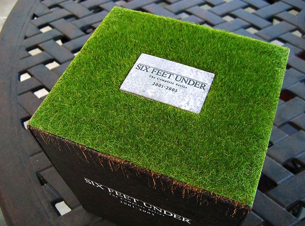
Six Feet Under DVD Case
A compilation DVD set of popular series ‘Six Fee Under’ featuring a grass roof with an embedded tombstone.
Doritos Nacho Cheese Chip Packet..mmm
Clever collapsable packaging of a Doritos chip packet picking up on the triangular shape of the chips.
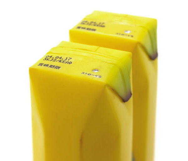
Banana Milk – Sustainable Design
Why not use a banana as the casing of banana milk? A fantastic example of sustainable packaging.
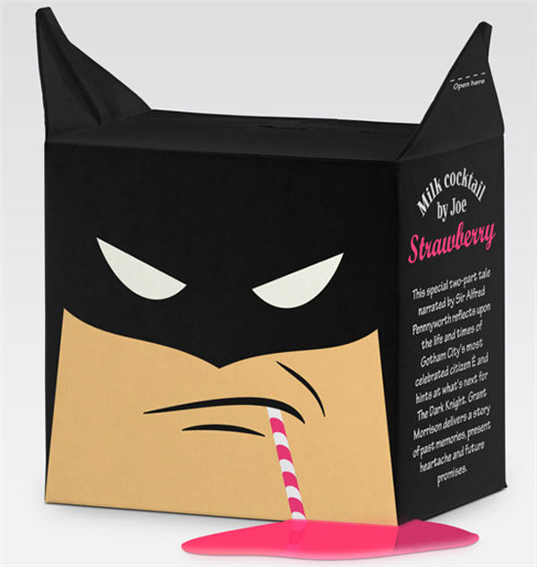
Strawberry Milk With An Attitude
Naughty strawberry chocolate milk featuring an angry batman with the tabs of the package acting as the masked avengers ears.
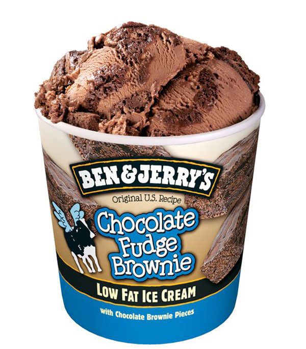
Ben and Jerry’s Yummy Fudge Brownie
Ben and Jerry’s Ice Cream is world famous and as a piece of packaging design it couldn’t get more standard. However the mouth-weatering cartoon-styled graphics make the ice-cream feel like a real fun treat. Utilising actual photos of chocolate, cartoon cows and round bubble text the label does a great job in appealing to the young market.
Nelson Beer
This Nelson beer brings with it a real unique label design with a mix of modernism with indigenous Indian design aesthetics.
Light Bulb Packaging – A Little Different
This packaging design is extremely simple and standard, however it has made the list because it is lightbulb package! A product packaging which appears to have never had a graphic designer work on it since its inception. Most light bulb packaging features dreary engineering drawings and overly bulbous text, this is a real treasure.
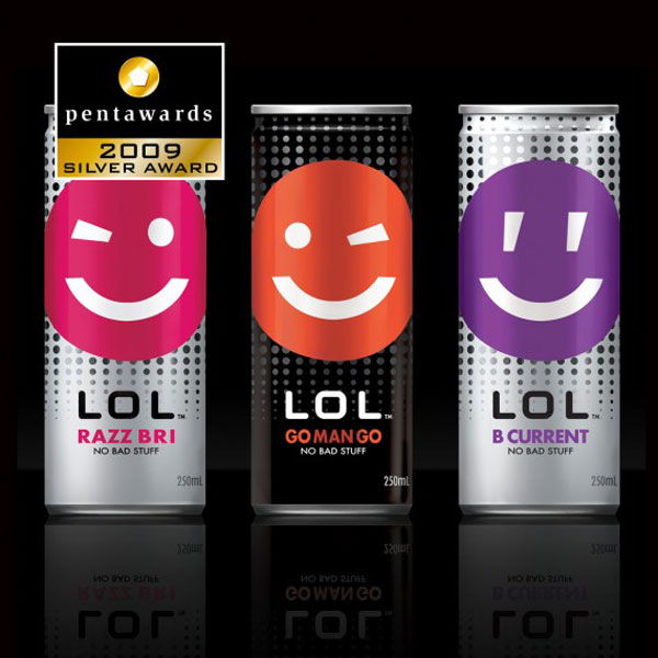
LOL!!! It’s Actually Not That Funny
This popular Japanese shaped can is so iconic in modern drinks whether it be ‘V’, ‘Mother’ or Red Bull’. The aesthetic design of this can is nothing special but I believe is a real stereotype of modern drink label design being cheerful, playful and cute.
Simple Olive Oil
Gigantic justified low contrast text saturates this primitive army-rationed styled can. A lot of adjectives for one little can, but although this can is most simple it has a great personality; it is stern and it is minimal.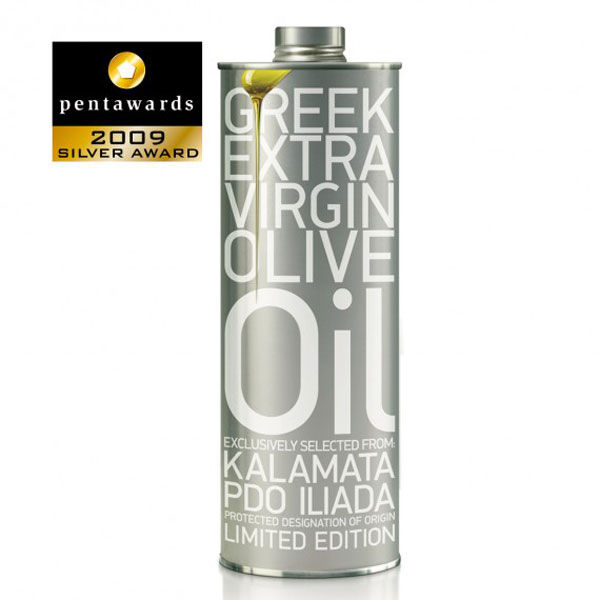
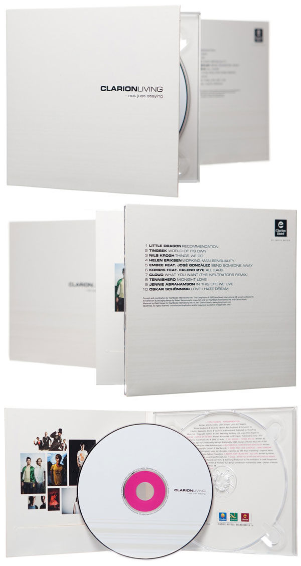
Minimal CD Packaging
Another example of minimalism. Minimalism has great beauty in modern culture because it is all about space real-estate. So often whether we are in magazines, websites or even on TV, everything is cluttered and filled with advertisements. It is refreshing to see designs like this, yet it is somewhat frustrating to know the designer was probably paid a lot of money to do it and it probably took them 5 minutes.
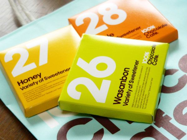
Colourful Chocolate Package
A collection of colourful chocolate packages. A very swiss Helvetica styled package featuring strong bold lettering.
Cute Coco Package
This recycled cardboard package is a modern interpretation of Japanese animation and art nouveau. Yet it also falls into an emerging graphical genre of alternative design featuring childish fonts and simple vectors.
TNT Cocoa
Another recycled cardboard packaging design in a shape of TNT dynamite.
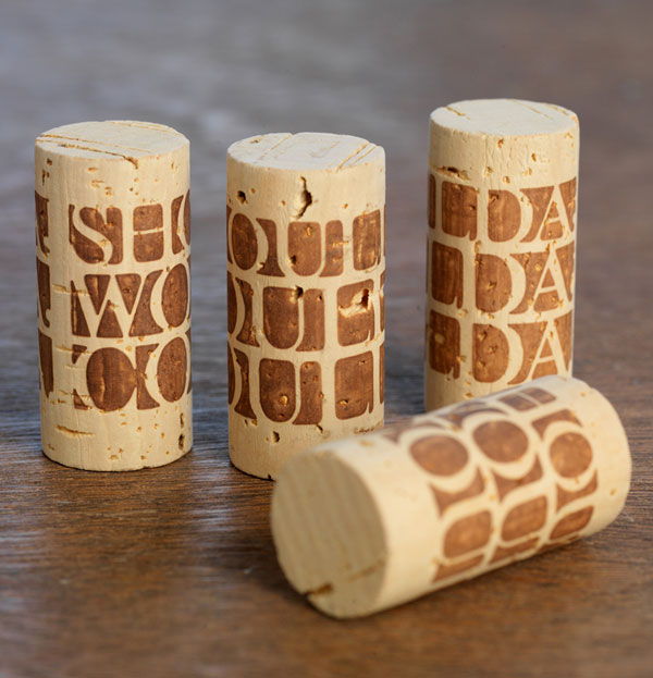
Cork Label?
Why not print on a cork, a detail that wont go unnoticed.
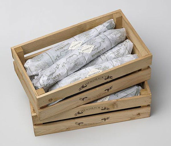
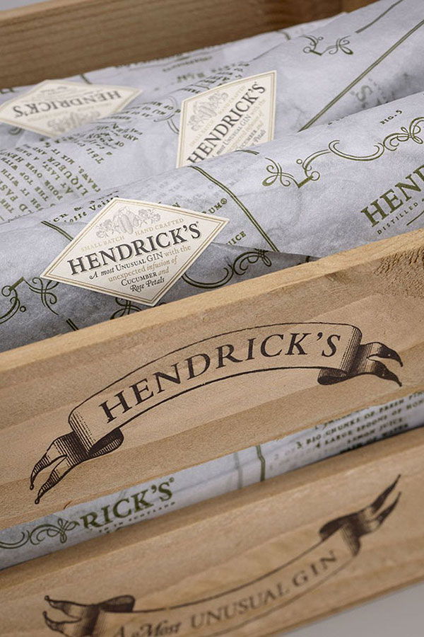
Country-styled Cucumber Package
A great example of early 20th century farmer-styled packaging applied to modern products. The design does signify to the audience a sense of freshness by having a crudely constructed wooden frame protecting the produce.
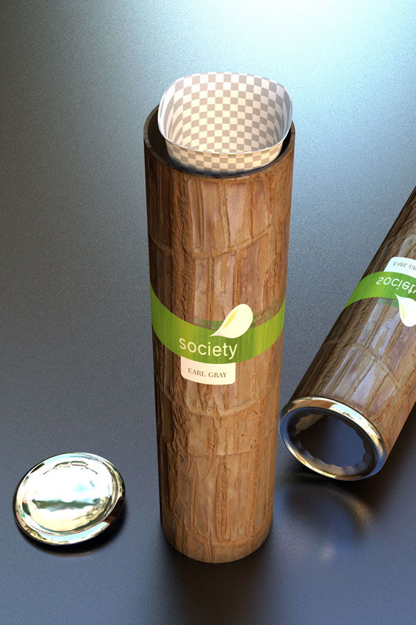
Jungle Tea Packaging
Tea packaging inside a bamboo branch overlaid by modern typeface.
Space-age/Western Egg Carton
This egg carton design is an interesting mix of aesthetic genres. The carton itself if cast from steel could be said to appear very space-age with a protruding construction skeleton and curved surfaces clashing with strong prisms. Yet the aesthetics of the type face reveal a very country western tone, but all in all are very supplementary to one another.
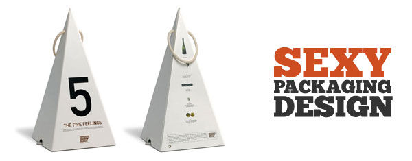
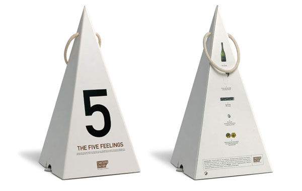
The Five Feelings Chocolate
Triangular prism shaped chocolate packaging.
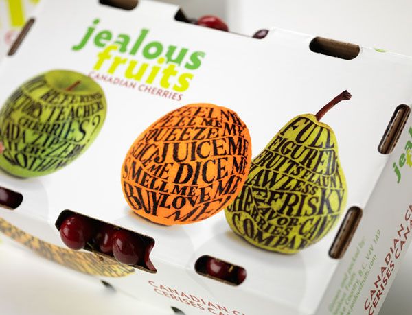
Fruitful Packaging
Very colourful fruit packaging featuring another typeface trend of making shapes and patterns out of the text itself.
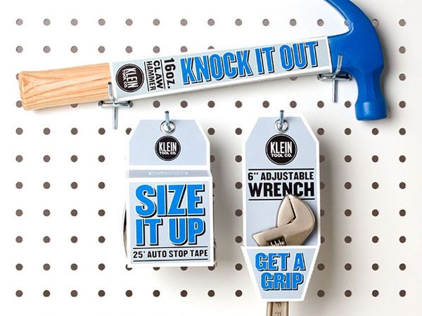
Bold Hardware – Klein
This bold hardware packaging complements the products beautifully, however on its own this packaging could come as very 80’s styled with its outlined and extruded text.
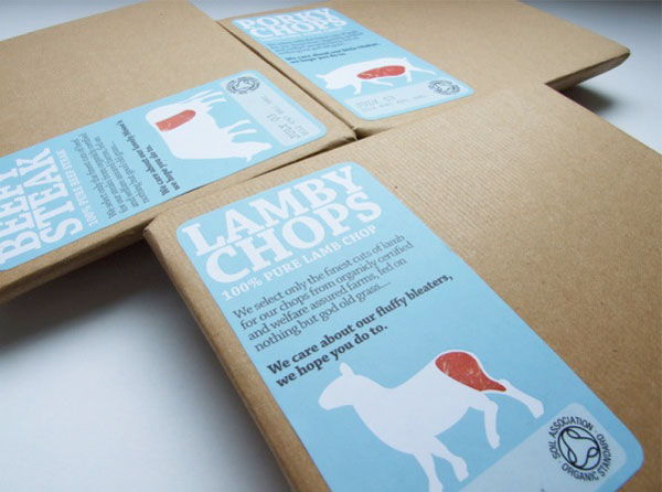
Lamb Chops Anyone?
This design follows on from many other recycled paper designs. The great aesthetic success of this label is its harmony in type and its colour combination. Although I think revealing what part of the animal the meat came from will please many users.
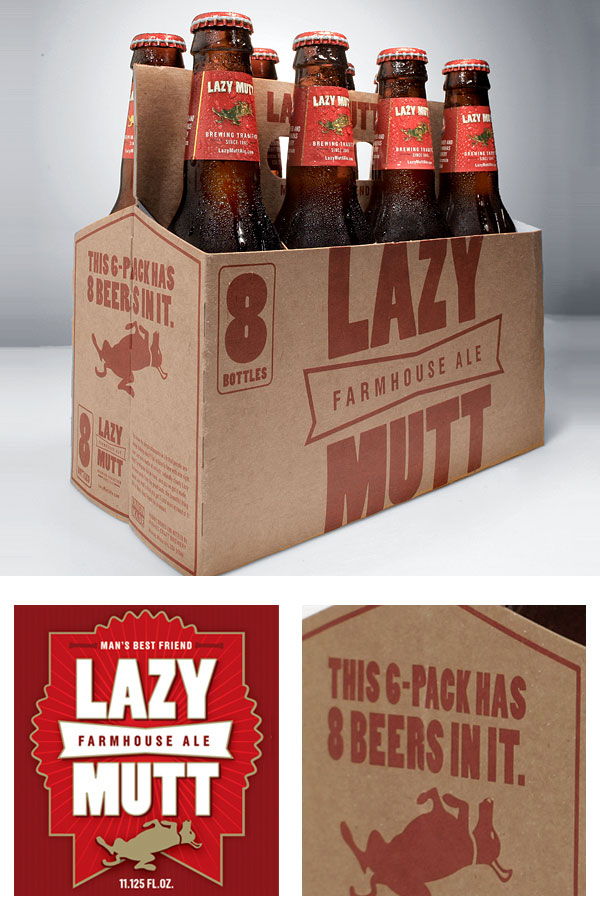
Lazy Mutt Beer Packaging
Mouth-watering and recycled.
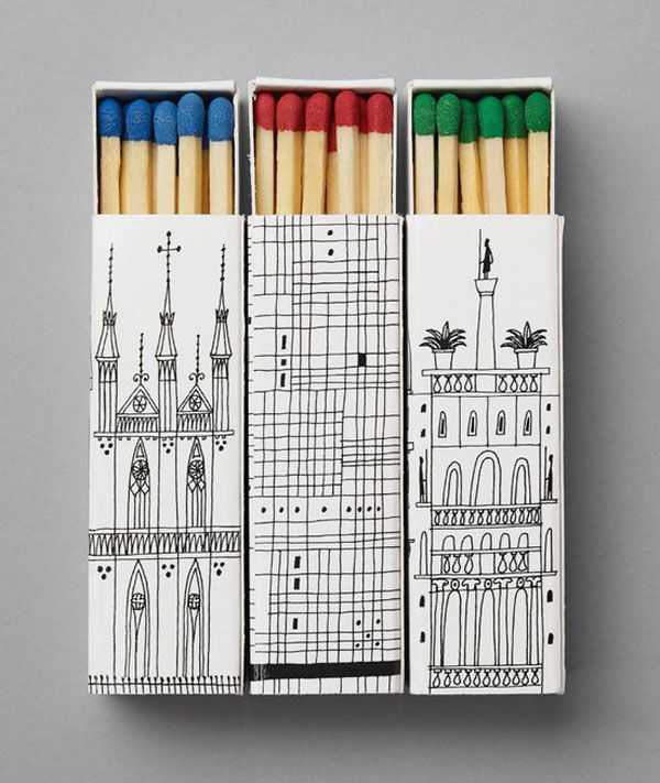
Matches
Cute Persian-styled cartoons on an elongated package.
More Cute Matches
Cute Japanese matches.
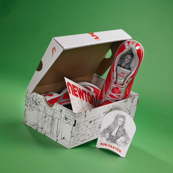
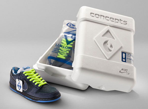
Holistic Shoe Packaging Design
It is rare that we ever see the design of the packaging so detailed and complementary to its enclosed product.
Durable Shoe Box Design
This durable heavily filleted show box stands out from the crowd and really exemplifies the shoe as being truly premium.
Nine Spice Rub
Cocoon shaped spice jar featuring stainless steel rim and black leather-textured inset.
Perfume Design
Mambo meets perfume in this fragrance for teenagers.
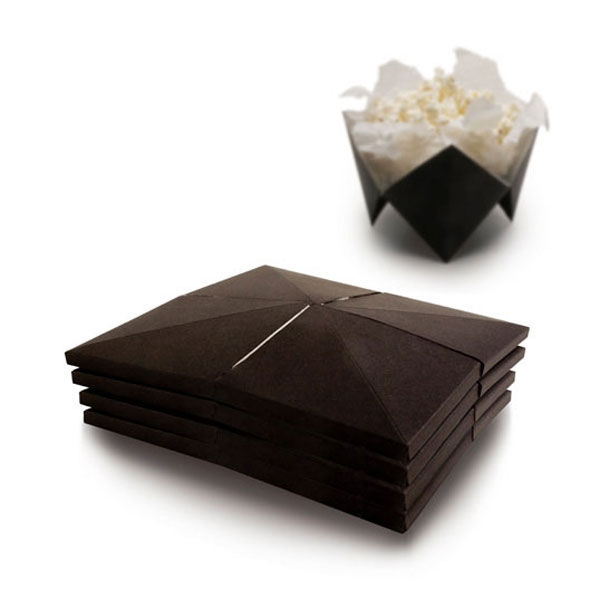
Popcorn Packaging Design Concept
Popcorn packaging that resembles children’s fortune telling game.
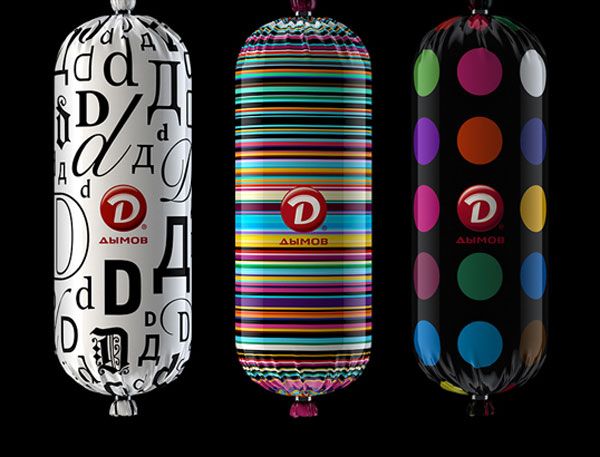
Meat Packaging Design
No one would think that this beautifully decorated label would house a sausage. It’s like a teenage girl tampon packaging designers attempt to design meat wrappers, but stunning results!
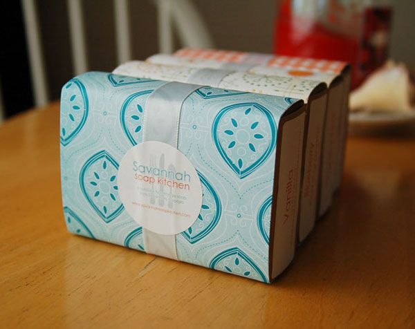
Pretty Soap – Savannah
A very home-crafted styled soap packaging.
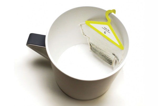
Tea Bag Coat Hanger?
Why not use the iconic shape for hanging our clothes and re-use its purpose as a way to hang tea bags onto the side of a mug? Different!
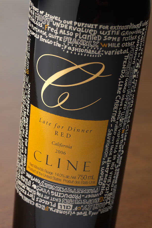
Wine Label Design
A wild mix of typography on this label!











23 Comments
very sexy!
[…] This post was mentioned on Twitter by Martin Gibson, Martin Gibson. Martin Gibson said: New Blog Posting, Sexy Packaging Design – http://bit.ly/4B4i2q […]
I really much enjoyed the doritos and the sausage wrappings, thanks for tha post
Thanks for the comment 🙂
Social comments and analytics for this post…
This post was mentioned on Twitter by embody3d: New Blog Posting, Sexy Packaging Design – http://bit.ly/4B4i2q…
IS THE BANANA MILK AN ACTUAL BANANA OR PLASTIC OR RUBBER OR SOMETHING?!?
I believe it is plastic, but I can’t see any reason why you couldn’t use an actual banana but I am not sure how you would fasten it all together so it doesn’t leak and fall apart.
The Nike shoe design box doesn’t look exactly sustainable. I thought this post was supposed to be about sustainable packaging?
I love the light bulb packaging – so true! It’s so mechanical and (these days) green-washed that it makes me cringe. Have you seen new packaging redesign for the last original Polaroid films? http://www.polapremium.com/news?date=2009-12-18
That’s a cool package redesign as well. Thanks for the link Fiona!
Solid Collection
“It is refreshing to see designs like this, yet it is somewhat frustrating to know the designer was probably paid a lot of money to do it and it probably took them 5 minutes. ” Designers should be paid for the value they add, not the time spent. If it took 5 mins but the CD sells millions of copies, how ticked would you be that you got paid $5?
great collection tweeted it baby
Really this is the perfect example of sexy packaging that can influence the buying psychology and persuades the customers in buying the products. This is aesthetic and impressive packaging that can bewitch the lookers. The packaging industry is very dynamic and innovative and has undergone great transformation in view of incessant introduction of new products, evolution and globalization of technologies. So it’s important to keep watch on how the packaging is changing and going to change in future.
[…] Sexy Packaging Design […]
Packaging design is adding spice to our daily life! Great Designers!!
treasure for admins lovbe you preserve impressing us! properly worth the study.I uncovered it pretty beneficial as I’ve been.
Great packaging designs!!!…….it really brings life to the boring content inside them..it´s all about fun…..
hey im just wondering if this stuff was actually printed??
[…] Image Credit: Embody3d […]
[…] more cool and sexy package design click here Share this:TwitterFacebookLike this:LikeBe the first to like this […]
[…] more cool and sexy package design click here Share this:TwitterFacebookLike this:LikeBe the first to like this […]
I’ve read a few good stuff here. Definitely worth bookmarking for revisiting. I surprise how so much effort you put to create this type of excellent informative website.