The Colours of Product Design

- black rubber
- China
- Christmas
- colour blindness
- colour differentiation
- consumer electronic products
- designer
- Egypt
- Embody 3D
- energy
- glossy product
- green
- harmonious product
- industrial design
- issue
- Japan
- Martin Gibson
- matter
- Nintendo
- outdoor products
- Product
- psychology of colours
- red/green colour blindness
- stainless steel
- symbol
- textile designs
- translucent plastics
- triad
For many product designers the consideration of product colour is often an oversight. It is quite often the very last aspect considered in the design process, but in many regards it is one of the more important decisions that must be made. I believe many industrial designers have a self-serving perspective of colour selection, picking more the colours they think look ‘sexy’ rather than choosing a colour justified through research. Have a look through your portfolio of products and like I, I think you will be surprised by the lack of consideration and time you might have put into colour selection. For some consumers the colour selected by a designer is of critical importance especially in fabrics and textile designs. In this article we are going to explore the psychology of colours in products and general considerations you should apply in the design process.
Article by Martin Gibson – Twitter – 05.04.2010
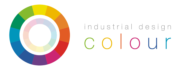
The Properties of Colour
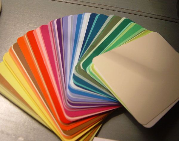
When it comes to colour there are only 3 basic properties you need to know:
Hue – hue is tonal property, adjusting the hue of a colour adjusts lets say a blue into a green or a red. It is probably the most fundamental property.
Saturation – saturation is the measure of intensity in a colour. Decreasing the saturation of a colour turns it into a grayscale colour, whilst increasing the saturation will make a colour more vibrant.
Lightness/Darkness – lightness and darkness is pretty self explanatory. Increasing the darkness of a red for example will turn it into a maroon, whilst increasing the lightness of a red will turn it into a pink.
Colour Accessibility/Ergonomics
When designing controls or objects where colour differentiation is important, consider taking in mind that almost 1 in 12 humans (particularly males) suffer red/green colour blindness. Although from an aesthetic point of view mixing together green and red in the first place is just a huge no no (think about the corny Christmas tree connotation). But there are also other types of colour blindess including blue/yellow colour deficiencies to take into account. People who suffer from colour blindness tend to have different contexts where their symptoms are most prevalent. For example, in different lighting conditions or when looking at colours on screens these deficiencies can be accentuated or reduced.
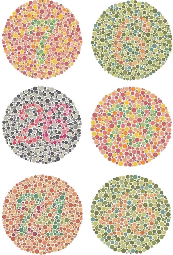
Some products we design tend to be used at night and any way to increase a products visibility in these conditions could only be beneficial. For example, vehicles, signage and lighting products are just some of the itmes that are important to be able to see in low-light environments. Different colours can in fact be viewed more easily at night. In darkness the eyes maximum sensitivity shifts towards the yellow and green wavelengths (also commonly known as the chartreuse spectrum). In juxtaposition red is the worst colour to see at night, closely followed by blue. This might change your design decisions next time you design a flashlight.
Colour Durability
Your mother might have always told you to never buy white shoes because they get dirty real quickly, and she is right. We all know that white colours show dirt, scratches and other abrasions more visibly than darker colours, hence why bike frames are almost always black. People don’t enjoy cleaning outdoor products (or any products for that matter), so if your product is likely to be subjected to these types of conditions make it easier for your user. 
Colour Stereotyping
Later in this article I am going to talk about how some psychological theorists believe that different colours evoke different human emotions. While this matter may be debatable, one issue that is certainly not disputed is that our society has stereotypes surrounding certain colours and colour combinations. We all know the common innuendo that boys like blue bikes and girls like pink bikes, a cultural stigma that was created just after WW2. But we all know in a parallel universe it could easily have been boys that liked pink bikes and girls who liked blue ones. Apart from the masculine and feminine stereotypes in our culture to consider there are other colours that evoke imagery of events and symbols. For example name me a valentines day when red wasn’t the feature colour, or a St. Patricks Day when green wasn’t the theme colour? Or a soccer match where Australian supporters didn’t wear green and yellow and Americans didn’t wear red, white and blue, and the list just goes on and on.
Colour Trends
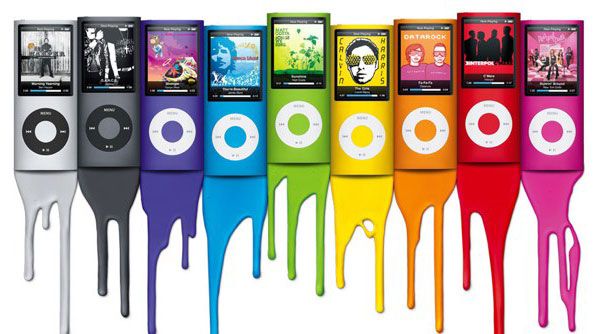
In some industries there seems to be seasonal trends in colour, and colours that just seem to be timeless. Although we tend to think it is only fashion design where certain colours may be in our out, we forget that there are iconic designers and businesses that champion certain colour looks that tend to shape whole industries. These seasonal trends can’t be under-estimated or ignored. Of course in some cases it may be difficult or impossible to modify product colours as strategically your business might have certain branding colour constraints. At the same time however I struggle to think of one brand that has maintained it’s product colour image since its inception, even Apple has gone through colourful stages.
Staying Safe With BnW
Talking about colour trends, black and white just seem to be the most neutral and timeless fashion colours of all time. It is the default colour choice for the introverted, conservative or farouche. Yet it is these colours that proclaim a real sense of elegance and sophistication. Every now and again you get the good old metallic silvers and a threshold of intertwined grayscales to accompany these primaries, but it is really the black and whites that are making all the noise. These colours are safe and are great for products that you don’t want to stand out, like an air-conditioning unit which just seem to be 99% of the time white. Just think about consumer electronic products which always seem to be black, white or grey with the odd thin highlight colour here and there.
The Power Of Contrast
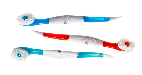
Our eyes tend to be attracted to high contrasting colours, and this tool should be utilised by industrial designers sparingly and when of great importance. Sometimes you may want to use high contrasting colours to grandstand your product, whilst in other scenarios high-contrast might be some form of market suicide. Just recently Colgate released a micro toothbrush that requires no water and is to be utilised by users throughout the day when they feel they need an extra brush (yes talk about product overkill and sustainability). Regardless of the products weak justification to even exist, one must recognise the colour selection although fitting in with typical Colgate design image, utilises colour contrast poorly. The practice of brushing your teeth in public is not a publicly accepted practice, however the design has gone for a very vibrant, high contrast colour scheme. This was of course probably planned by the marketeers to get other people approaching these ‘day brushers’ and asking them what they are doing to their teeth, or perhaps this whole colour issue isn’t a big deal and was never even considered?
In some scenarios this high contrast can be used to great effect particularly on controls and handles. These colour contrasts act as visual cues to the user to insight something must be done there. Take for instance the drill below. The designer has intelligently used high contrast black rubber on all areas of the drill to signify to users where their hands should be placed for safe practice. Likewise the colour of the trigger, lock button and drill adjustment are also black carrying on this same theme. This drill is just a great example of ingenious yet simple colour selection from a usability and aesthetic point of view!
The Psychology Of Colours
Many scientists, lighting designers and psychologists have been advancing the idea that different colours evoke different human emotions. I am not going to advocate this arguement as I believe there lacks sufficient proof, however I am going to list it as a factor to consider when selecting colours to use in products. The question is, does the colour red make people happy and fervent? Does yellow raise alertness? Does white symbolise purity and cleanliness? Does blue portray feelings of tranquility and calmness? Does black signify a sense of mystery, loss and anonymity? Or are all these byproducts of our culture and human cognition? Although many colour scientists would swear by these notions, a more global perspective will show the inconstancies of this theory. For example the colour white in Egypt is a symbol of joy, whereas in China white can be a symbol of death. In China green is considered to be of the heavens and the sky whilst in nearby Japan green is a symbol of youth, energy and fertility. Scientific or not, this colour psychology should be considered by designers regardless because they withhold cultural significance and connotations.
Colour Balance
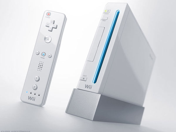
Graphic designers can tell you all about colour balance. This principle should equally apply to industrial designers. Graphic designers when designing logos for example will designate certain colours as being primary, secondary or highlight. The aim is of course to create a visual hierarchy to the user and not cause a graphics conflict. Like a logo you don’t want your product to contain every colour in the rainbow as this only adds complexity to your product design. In many harmonious product designs you will find there will be a dominant colour, followed by an optional complimentary tone, and then if necessary a small highlight colour. Take for instance the Nintendo Wii design (pictured above). The main body of the game station uses a primary white colour, the base of the product utilises a secondary light grey colour. As a highlight to give that touch of class, a light blue colour is used to contrast it from the grayscale body.
I found a fantastic website which will generate complimentary, triad, tetrad and analogic colour schemes. This might be a great reference point when designing colour patterns for your products.
http://colorschemedesigner.com/
Shadows, Reflectivity, Opacity and Lighting
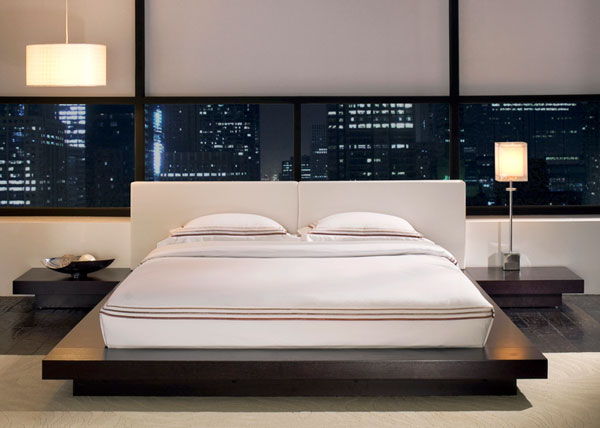
Lastly, one must consider the material properties and the surface finish of certain materials and how this affects colour. When dealing with complex three dimensional forms be weary that light coloured objects are likely to reveal internal shadows, where as dark objects are likely to cover up these shadows. For example the below interior space utilises both white and a dark wood colour scheme. Notice how the dark wood seems to hide shadows and areas of light, where as the white accentuates these lighting contrasts.
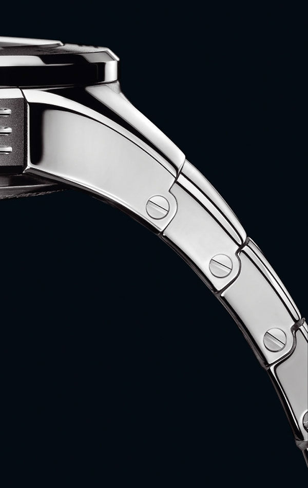
If designing a glossy product consider the reflectivity of some of the self-facing wall sections and the appearance this gives to your product. When the user is at a particular distance or angle from your product this reflectivity might not look as cheerful as your concept renders first envisaged. Take for example the highly reflective material of chrome or stainless steel. When in certain lighting conditions these materials can actually look very dark in places whilst in others look very bright, despite the fact the foundational material is uniform. A collection of flat surfaces will give off extremely sharp and definitive lighting tones on the surface, whereas spherical and rounded surfaces will give off very smooth and gradual lighting tones on the surface.
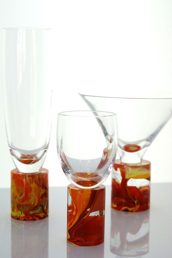
Likewise consider opacity, particularly in reference to glass and translucent plastics. If you can see through a wall section of your product what is it revealing behind it? Are there multiple layers of opacity which might add a real complexity to the form of your product. Notice in the below glassware the different shades and reflections caused when there is 1 vs 2 layers or glass or when the glasses thickness is increased or decreased.
If there is light in your product how is it absorbed and distributed internally. Where is ray tracing occurring? Does the light source change colour or reflect differently when hitting different material types. Notice the below Belkin product how the backlit keyboard lighting changes colour from a real distinct blue to an almost highlighted white. Notice also how the light is glaring onto some of the glossy black plastic and in others it is absorbed or reflected away.






2 Comments
[…] This post was mentioned on Twitter by JR IMAGEN GRÁFICA, Martin Gibson and Embody 3D, Martin Gibson. Martin Gibson said: The Colours of Product Design http://goo.gl/fb/W4ijm #featured […]
Я извиняюсь, но, по-моему, Вы допускаете ошибку. Пишите мне в PM, пообщаемся….
I believe many industrial designers have a self-serving perspective of colour selection, picking more […….